Portfolio·Works·BNP Paribas Cardif

BNP Paribas Cardif Insurance

Insurance Corporate Web Information Architecture Design System

Insurance is something people buy for their worst day — yet it's usually explained in the coldest possible language. I rebuilt BNP Paribas Cardif's corporate experience around a voice that makes the policy legible and builds trust.

View Live Site ↗
Role
UX & Product Design
Platform
Corporate Web · Mobile
Industry
Insurance · Bancassurance
01IMPACT & OUTCOMES

I rebuilt the site without losing a single function.

0
Screens
Screens designed from wireframe to final UI for desktop (1440px) and mobile web (325px).
0+
Insurance Products
I reduced twenty-plus scattered products into four categories: personal accident, protection, life and private pension.
0
Existing Functions
Every one carried over intact: calculators, application forms, fund tables, mandatory legal pages.
Information architecture rebuild Function inventory & benchmark UI Kit & component library Responsive web + mobile
02PROBLEM

I couldn’t delete anything. I could only rebuild it.

I had to solve these within the following constraints
Functions preserved as-is Global brand rules Copywriting out of scope Mandatory legal pages

This was a facelift: every existing function had to carry over as-is, and copywriting was out of scope. All I had was structure, hierarchy and visual language — against 87 pages, 48 functions and over 20 products.

Business Goal

Moving to a modern visual world and a new CMS without losing a single function.

User Problem

Over twenty products sat in one flat list; users couldn't tell which one was for them.

Design Challenge

Making products findable purely through structure and hierarchy, on a site whose copy I couldn't touch.
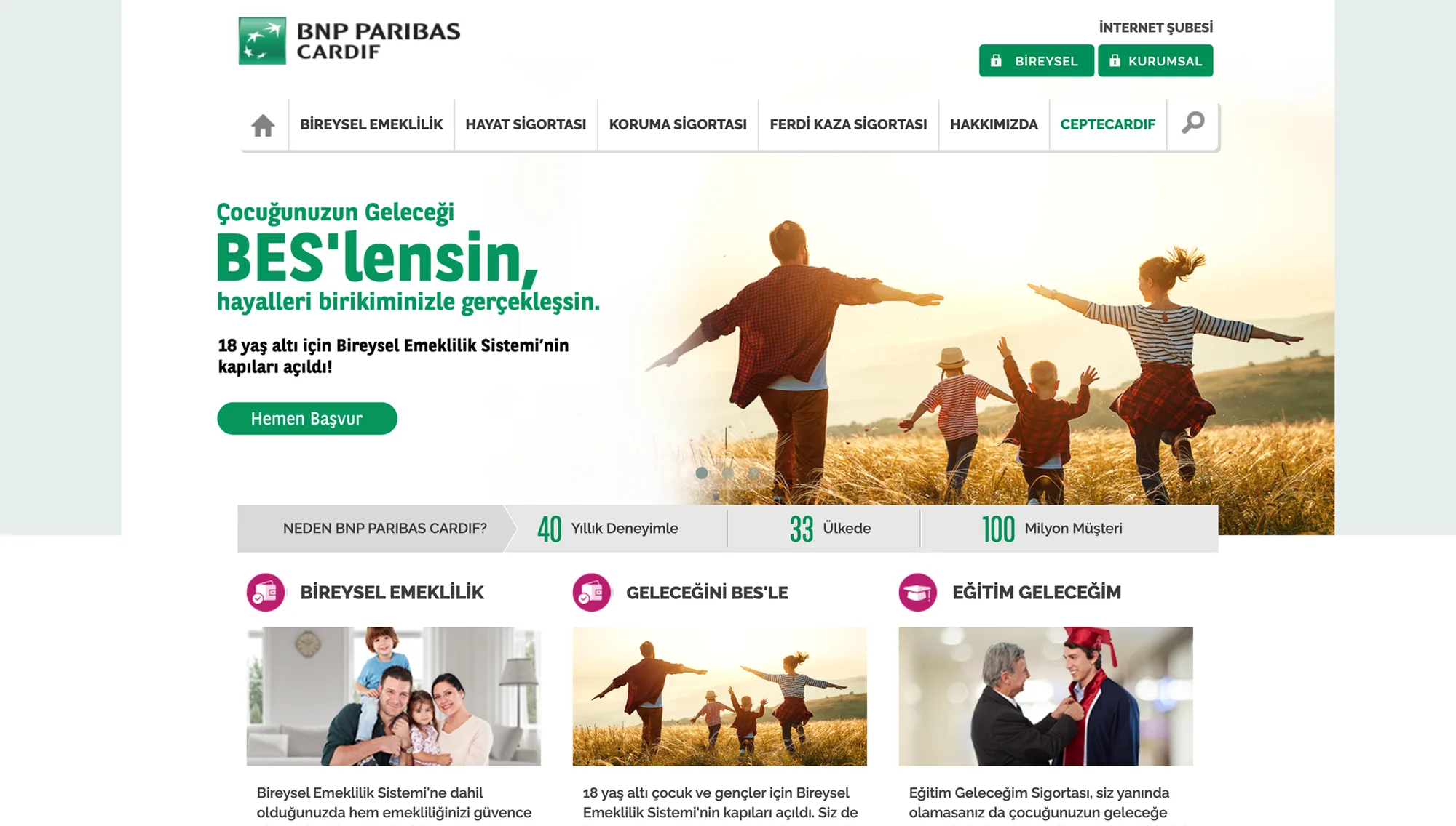
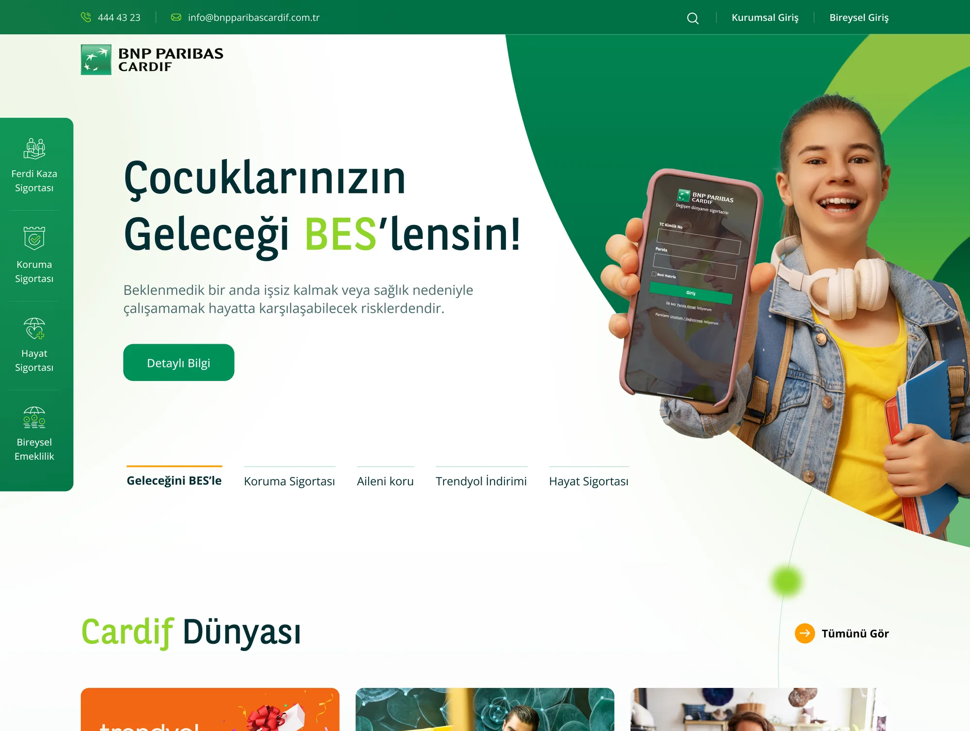
What I started with, where I took it
BNP Paribas Cardif — Önceki arayüz

Before

Problem
Corporate, legal language — users couldn't tell which product was for them or what it covered.
BNP Paribas Cardif — Yeni arayüz

After

What changed & why
The page now opens with a scenario, not a product name; coverage sits side by side and jargon-free, with the mandatory text in a disclosure layer.
03RESEARCH & DISCOVERY

First I found where the existing experience broke.

The research window was two weeks. I filled it with an inventory rather than assumptions: I catalogued every page, every function and every competitor. I didn't estimate the scope — I counted it.
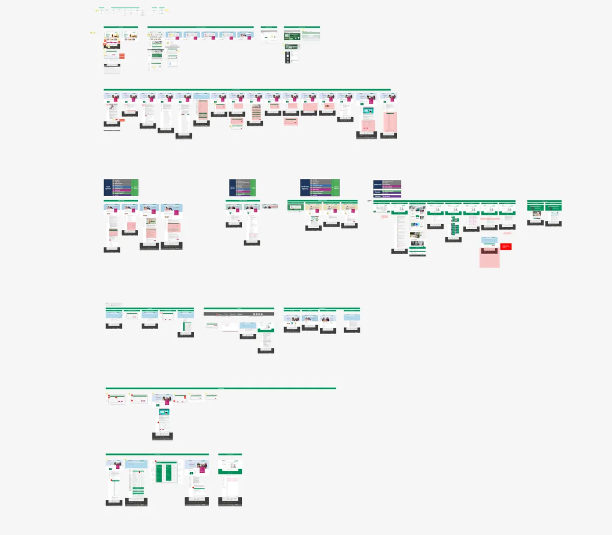
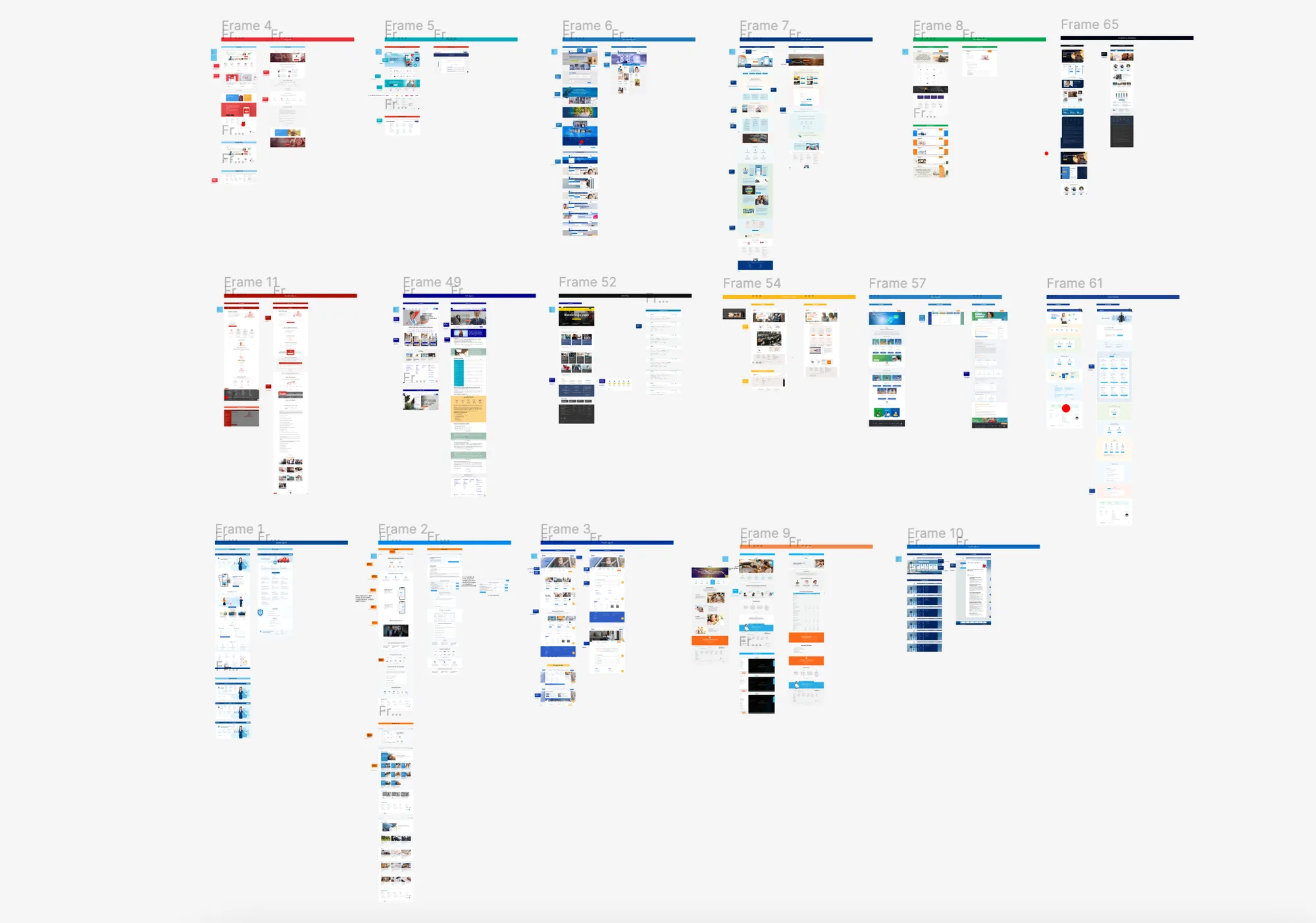
BNP — Uzman Analizi
Expert Review
I audited the live site screen by screen on desktop and mobile, flagging every break in navigation, hierarchy and forms.
Navigation · language · forms · hierarchy
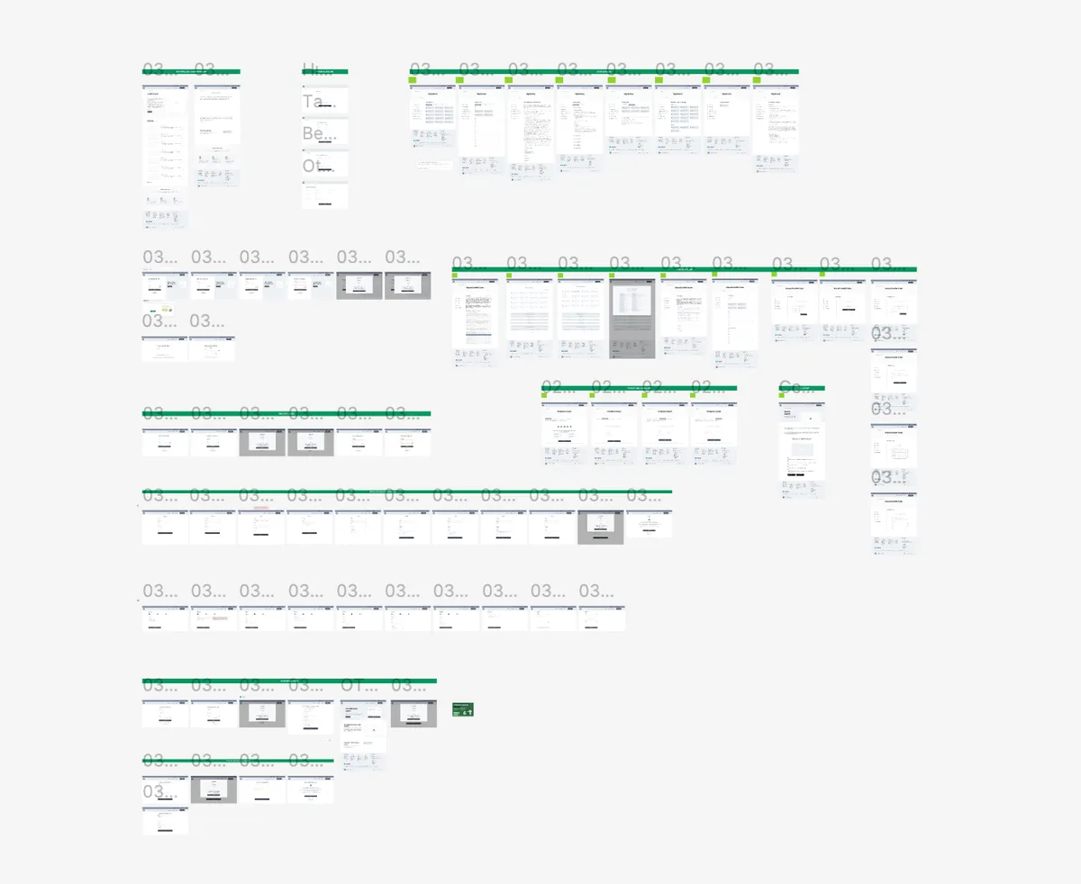
BNP — Ekran ve fonksiyon envanteri
Screen & Function Inventory
I listed all 87 pages and 48 functions one by one: which is static content, and which is a tool that needs engineering?
87 pages · 48 functions · 20+ products
BNP — Benchmark
Benchmark
I marked up competitor insurance sites with a colour-coded legend: which block is content, which is a form, which pulls third-party data?
Content ↔ form ↔ engineering-heavy page
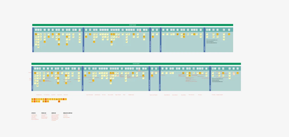
BNP — İç Ekip Görüşmeleri
Stakeholder Interviews
In the kick-off workshop we boarded strategy, opportunities, goals, risks and limits — the boundaries were clear before design began.
Strategy · Goals · Risks · Limits board
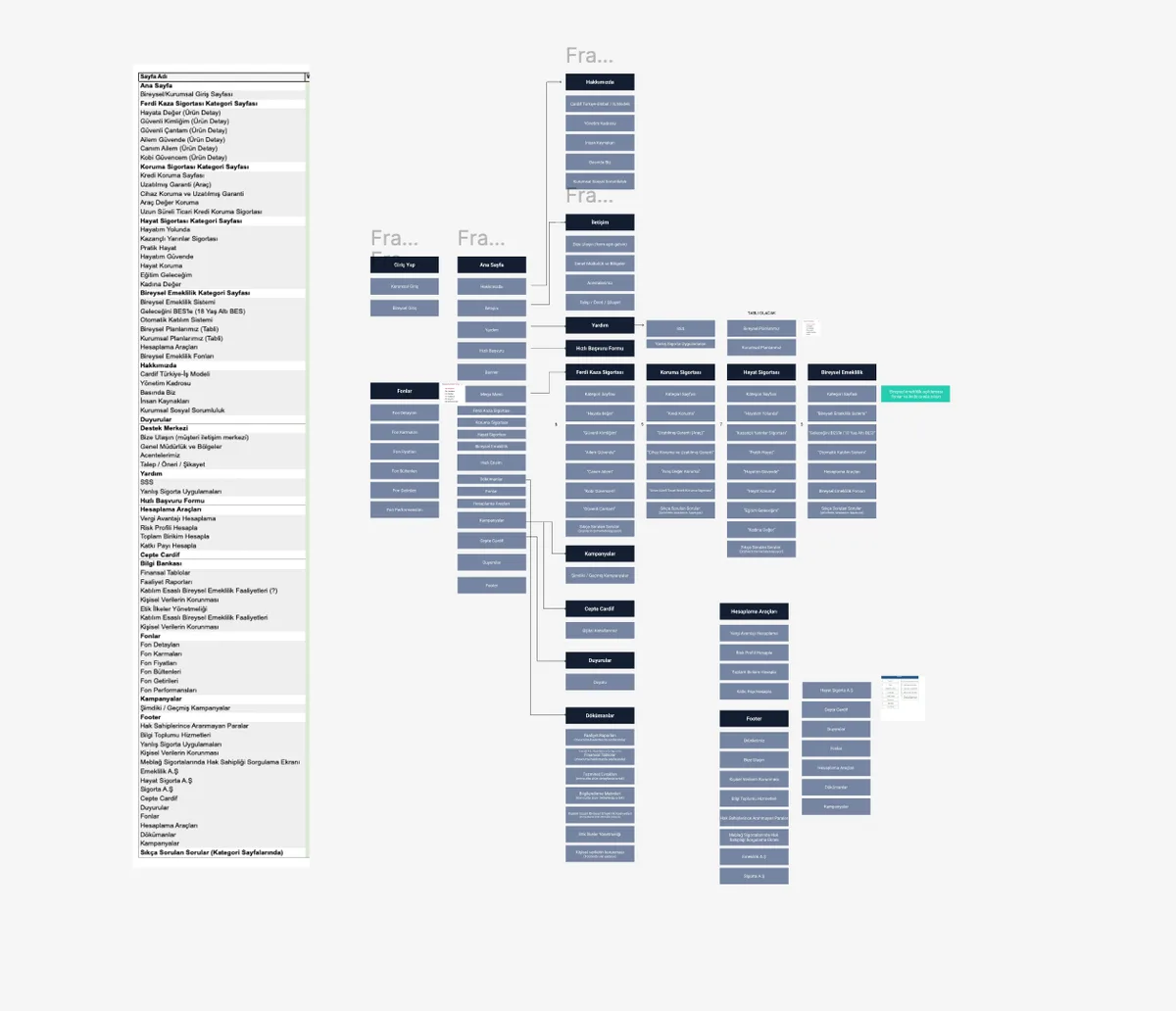
BNP — Bilgi mimarisi
Information Architecture
I took the client's sitemap and rebuilt it: 20+ products collapsed into four categories, and everything non-product moved under a Support Centre.
20+ products → 4 categories · 3 corporate sections
BNP — Sentez ve strateji
Synthesis & Strategy
I turned findings into principles: repeat the four categories everywhere, keep application one click away on every page, and place legal text close to the moment of decision.
Findings → principles → interface
The four findings the research surfaced
My role

I ran discovery: the as-is site audit, the 87-page screen list, the 48-function inventory and the colour-coded benchmark are mine; I set the boundaries in the kick-off workshop and turned the findings into design principles.

04BUSINESS GOALS

The goals the design served.

Every design decision tied back to one of these four goals.

05USER TYPES

Three different intents land on the same page.

I built the profiles from the three real intents that land on the site rather than from assumptions, and shaped the architecture around them.

BNP Paribas Cardif — Kullanıcı tipleri

The Researcher

Not buying yet — working out what they can protect themselves against. Needs: comparison and plain language.

The Policyholder

Already a customer — after a fund return, a claim form or a document. Needs: to find it without searching.

The Calculator

Choosing a pension plan, calculating a contribution. Needs: to see the number before deciding.

06USER FLOW & INFORMATION ARCHITECTURE

Twenty products, four categories, one mental model.

I collapsed twenty-plus products into four categories and repeated that four everywhere: a vertical rail on the homepage, tabs in the mega menu, an icon strip on mobile. Everything non-product moved under a single Support Centre.

01
Category
One of four: personal accident, protection, life, private pension.
02
Product
One of the cards on the category page is chosen.
03
Coverage
The coverage list and add-ons, with the application form right beside them.
04
General Terms
Disclosures and FAQs — close to the decision, without breaking the flow.
05
Apply
Form or phone — the two channels always side by side.
BNP Paribas Cardif
Products
  • Personal Accident
  • Protection Insurance
  • Life Insurance
  • Private Pension
Support Centre
  • Contact Us
  • Our Agencies
  • Requests & Complaints
  • FAQ
Quick Access
  • Calculators
  • Funds
  • Knowledge Base
  • Campaigns & Announcements
My role

I rebuilt the information architecture: from an 87-page inventory to four categories, from the repeating 'quick access trio' to the Support Centre umbrella — the whole structure is mine.

07DESIGN DECISIONS

Why I made these decisions.

Each decision answers a discovery finding. Not aesthetics — reasoning.
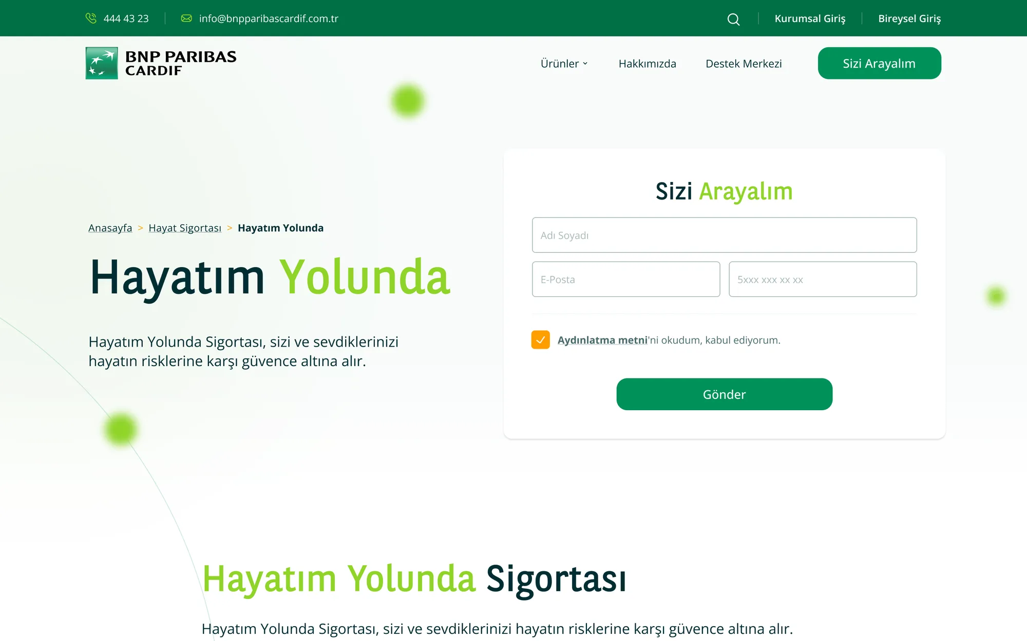
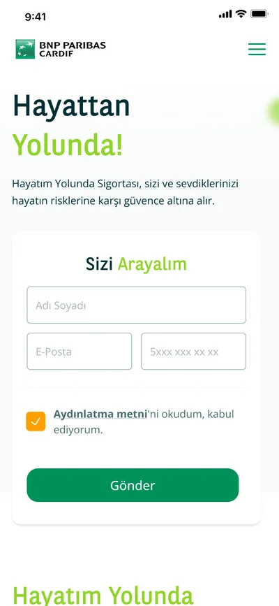
BNP Paribas Cardif — Ürün detay
01Moving the application form from the page bottom into the hero
Problem
The application form sat at the very bottom. Users couldn't act the moment they were convinced — they had to scroll the whole page to find it.
Alternatives
(a) Keep the form at the bottom with a sticky CTA, (b) move it into a modal, (c) embed it in the right column of the product hero, with the phone number beneath it.
Why this
(c): In insurance, conversion mostly closes on the phone. A form alone wasn't enough — at the moment of conviction, users had to see both the form and the number.
Result
Applying is not even a scroll away from reading — and for users who don't trust digital, a second channel is always open.
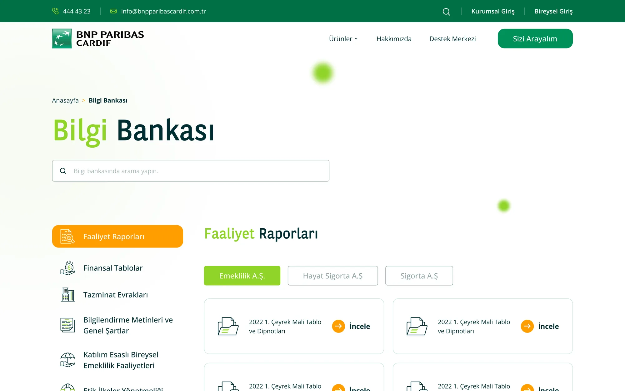
BNP Paribas Cardif — Bilgi bankası
02Distributing mandatory legal text across four layers
Problem
Consent notices, data-protection texts, general terms, regulator links… none could be removed, and all together they made the page unreadable.
Alternatives
(a) Gather it all on one legal page, (b) bury it in PDFs, (c) place each text at the decision it belongs to: a consent checkbox in the form, a notice before the calculator, document cards on the product page, fixed links in the footer.
Why this
(c): The text had to stay accessible, but it didn't have to pile up in one place. Legal text near the decision reassures rather than interrupts.
Result
Not one mandatory text was lost — and the page still reads.
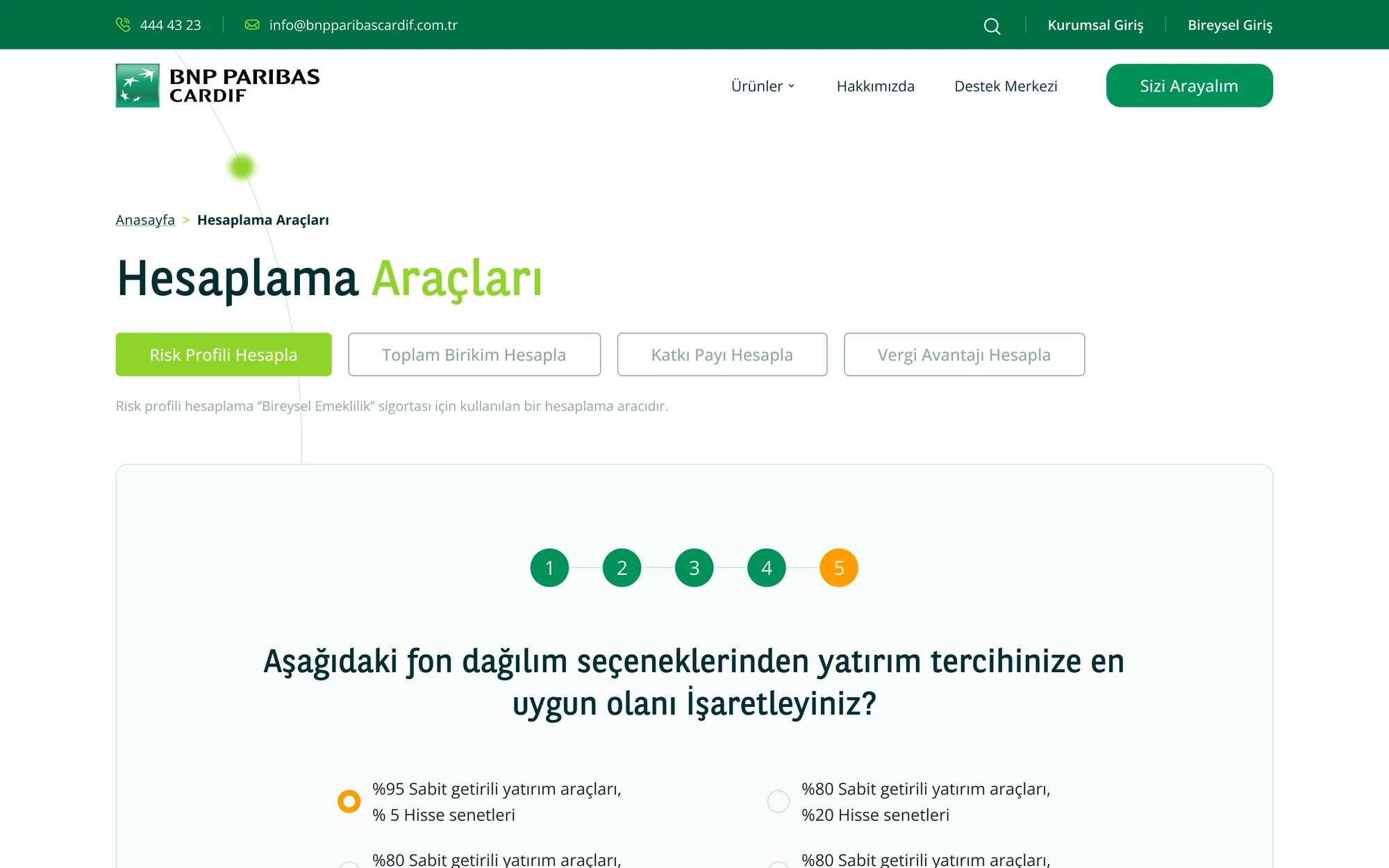
BNP Paribas Cardif — Hesaplama araçları
03Putting four calculators behind tabs on one page
Problem
Risk profile, total savings, contribution and tax advantage — four calculators scattered across four separate pages.
Alternatives
(a) Leave each calculator on its own page, (b) embed them all in the relevant product pages, (c) tab them onto one page and feed it from a 'quick access trio' at the foot of every page.
Why this
(c): Users who calculate tend to move between tools — one leads to the next. Tabs made that switch free, and the IA lost four pages.
Result
Switching tools is one click, and every page ends with the same exit ramp.
My role

I made all three calls: I synthesized discovery, weighed alternatives against legal and brand constraints, and implemented them in the UI.

08WIREFRAMES

From skeleton to final design.

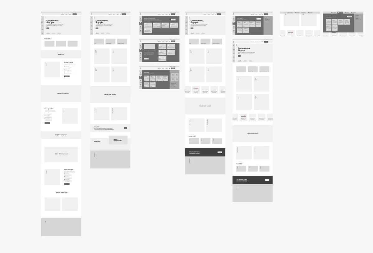
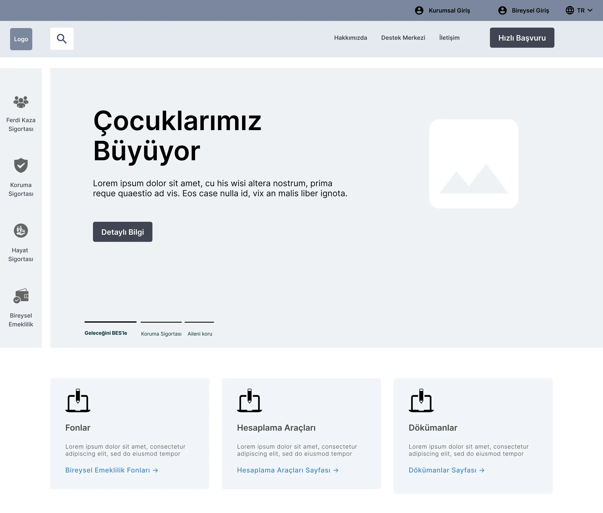
I validated the hierarchy before colour and brand arrived: scenario on top, coverage in the middle, mandatory text below.
BNP Paribas Cardif — Wireframe

Wireframe

Intent
Validating hierarchy and flow before colour arrives.
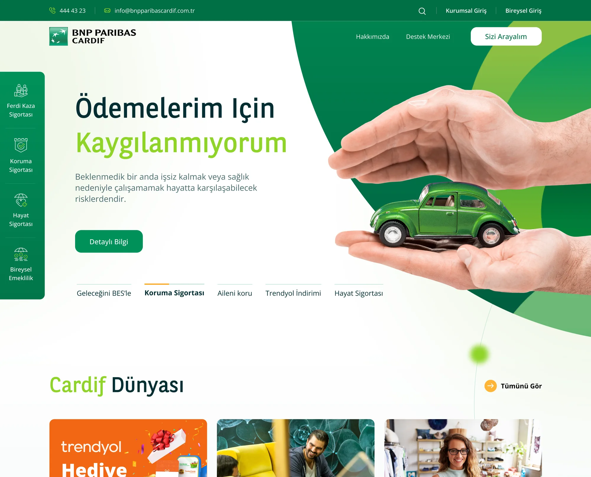
BNP Paribas Cardif — Final tasarım

Final Design

What changed
The same skeleton, brought to life with brand language and plain microcopy.
09DESIGN SYSTEM

A UI Kit built on top of a binding brand guideline.

The global BNP Paribas web guidelines and stylebook were binding — colour, logo and type were fixed. On top of them I built a UI Kit fed by the CMS that holds when a new product arrives.

Aa
InterNeutral, corporate, effortless over long text
#00915A
#12A97A
#00614A
#F0A202
#1D2B2A
COMPONENTS, GRID & STATES
Buttons
Get a Quote View My Policy Details Disabled
Cards
Credit Protection
If you lose your job, your loan instalments are covered.
Coverage is explicit
Critical Illness
A lump sum on diagnosis, so you can focus on treatment.
Sample scenario
Forms & States
National ID number Date of birth This field is required
Default Focus Approved Pending
Grid & Spacing
12 columns · generous space · a line length that breathes over long text.
My role

I built the UI Kit: without breaking the global brand guideline I defined the component library, the states and the spacing scale — components like the FAQ accordion were defined once and reused on every page.

10RESPONSIVE STRATEGY

The same clarity, on every screen.

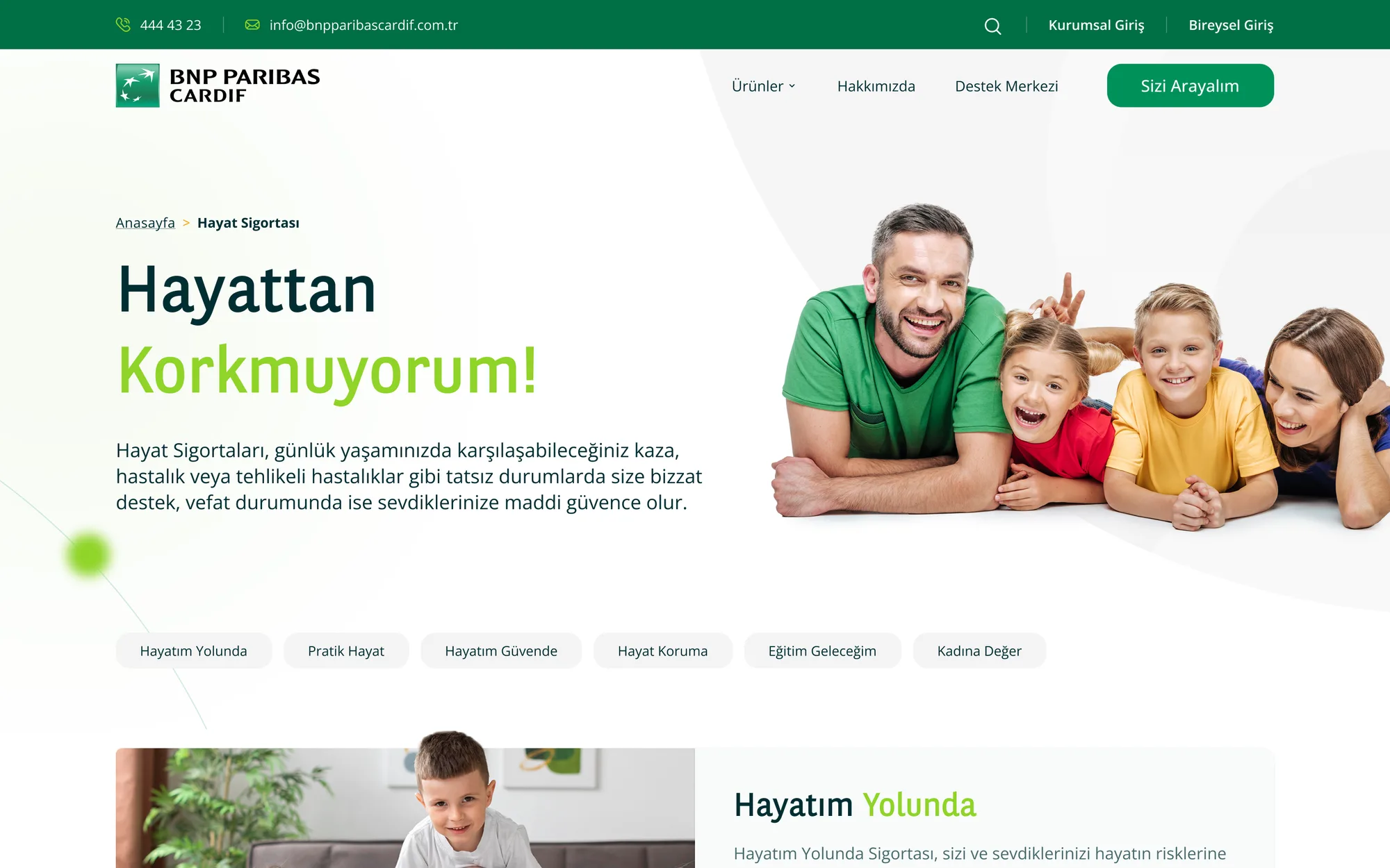
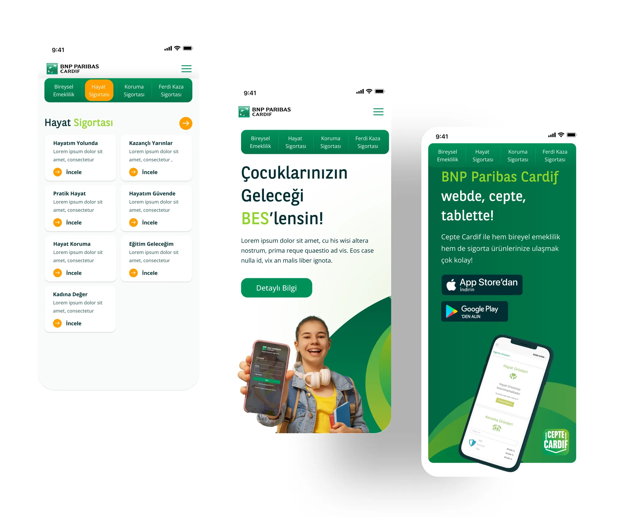
Insurance content can't be cut on mobile — but it can be ordered. On mobile I lead with scenario and coverage, keeping mandatory text in a disclosure layer.

Ürün kategorisi — masaüstü
Ürün kategorisi — mobil
Category
The product family sits side by side on desktop and stacks by need on mobile.
Ürün detay — masaüstü
Ürün detay — mobil
Product Detail
On mobile: scenario first, then coverage — the mandatory legal text stays last, in a disclosure layer.
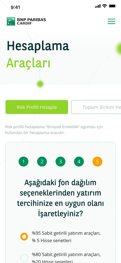
Hesaplama araçları — masaüstü
Hesaplama araçları — mobil
Calculators
The calculator drops to a single column for one-handed use, with the result pinned to the top of the screen.
The same content, the same clarity — the order changes, not the coverage
My role

I defined the breakpoint and content-priority rules, deciding what appears in what order on mobile based on the findings.

11FINAL UI

From homepage to colour palette.

BNP Paribas Cardif — Son arayüz
12REFLECTION & LESSONS LEARNED
"

Sometimes a designer's job isn't to add anything — it's to put what already exists in the right place.

On this project I could change neither the content nor the functions; all I had was structure. What I took for a constraint turned into focus — counting all 87 pages produced far better decisions than estimating would have. Starting over, I'd validate the four-category structure with a card sort before it shipped; back then I settled for the inventory.

01

Counting beats estimating

Listing 87 pages and 48 functions one by one was tedious — but every good decision came out of that list.

02

Architecture should mirror the user, not the org chart

When product grouping mirrors the company's internals, the user gets lost.

03

Repetition is the cheapest route to consistency

Repeating the same four categories in three different forms gave the user the same ground on every page.