Role
UX Research & Product Design
I redesigned PayTR end-to-end around a new brand identity to make accepting payments effortless for businesses. The goal: turn a complex family of payment products into a single, trustworthy experience that answers a business's questions — 'is it right for me, how fast can I set it up, is it secure?' — in seconds.
View Live Site ↗The product's strength was lost in interface complexity — reaching information and converting to an application were both slow.
The rich product family wasn't converting to applications; visitors left before finding the right solution.
A business couldn't quickly and confidently answer 'which fits me, how fast, is it secure, are there hidden fees?'
Simplifying many complex payment products without losing the trust, security and transparency message.
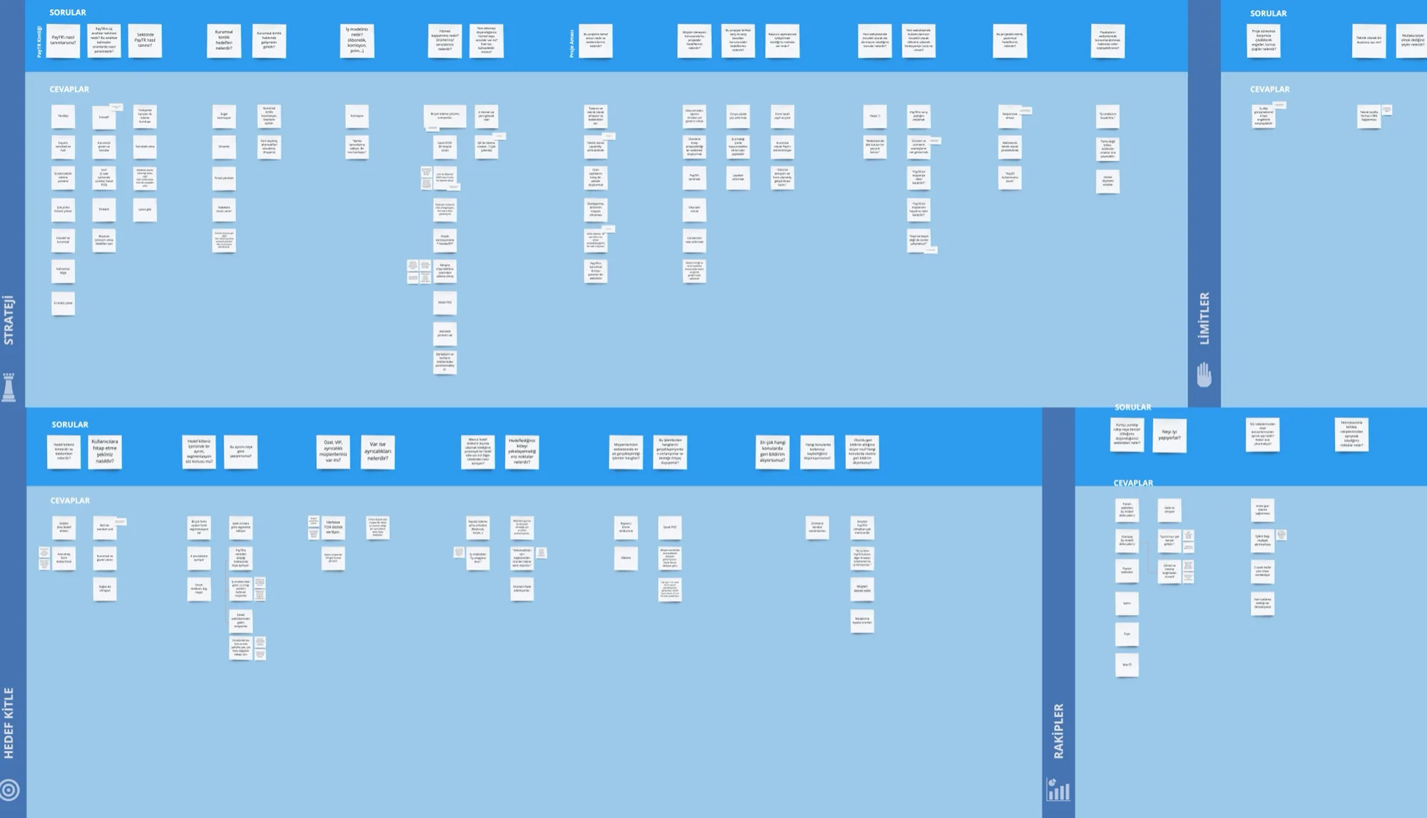
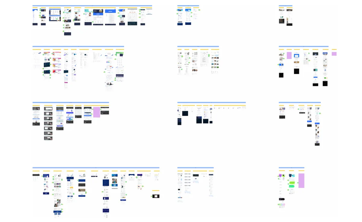
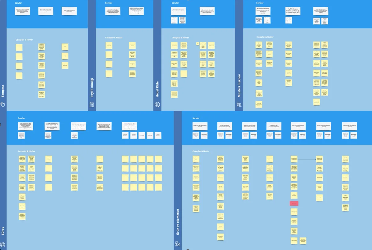
The timeline didn't allow primary user interviews. So instead of inviting users into a room, I went where they were already talking: forums, review sites, social media and closed groups. With netnography, benchmarking and stakeholder interviews I didn't assume the problem — I proved it.
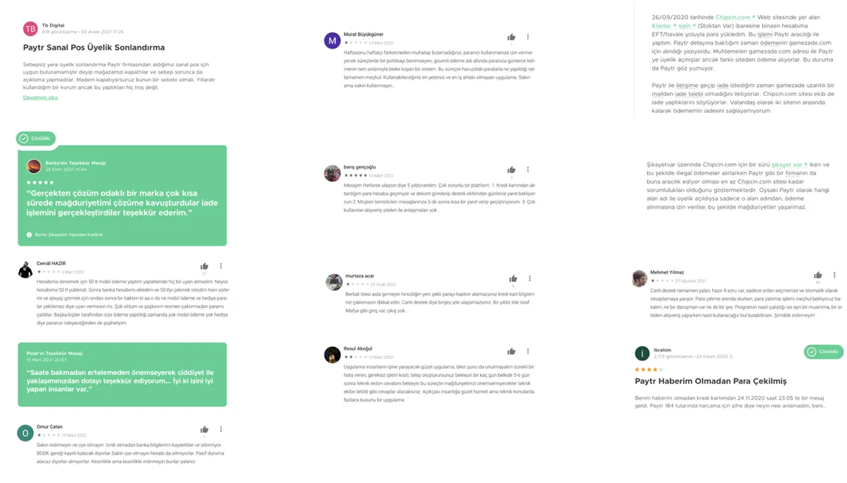
The website looks a bit intimidating. Very technical — only someone who can spend a long time at a computer would understand it.
Their site looks like it was literally built to avoid telling you the fees.
Give us a commission calculator so I don't have to work it out every single time.
I designed and ran the research: the netnographic scan, the benchmark and the stakeholder interviews; then distilled 183 findings into a theme map and converted it into the function list and design strategy.
Every design decision tied back to four goals: more qualified applications, clearer product understanding, stronger perceived trust, and lower support load through self-service information.
Move a business from the right solution to application with the least friction.
Make complex payment products comparable and easy to grasp.
Make security, transparency and speed felt at every touchpoint.
Reduce repetitive questions with clear self-service content.

In the kick-off, PayTR's audience was split into four revenue-based segments. Netnography then showed those segments expect entirely different things: small businesses want speed and cost, large ones want integration depth and compliance.

Limited technical knowledge; wants fast setup and transparent cost. This is the group that most often called the site 'too technical, intimidating'.
Looks for integration depth, regulatory compliance and API documentation. A long decision cycle that demands technical clarity.
Not everyone arriving is a business. Splitting the visitor onto the right path at step one was the clearest function recommendation from the research.
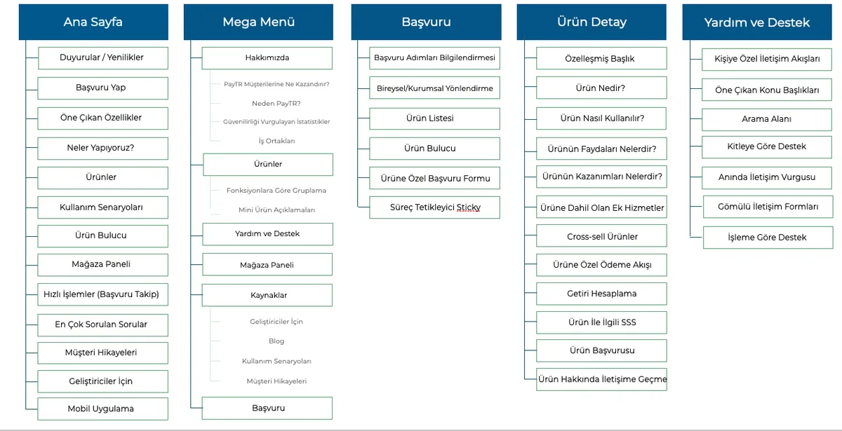
I shaped the business's path to reduce hesitation at every step, then grouped scattered products into three clusters that serve that journey. Flow and architecture are two faces of the same system.
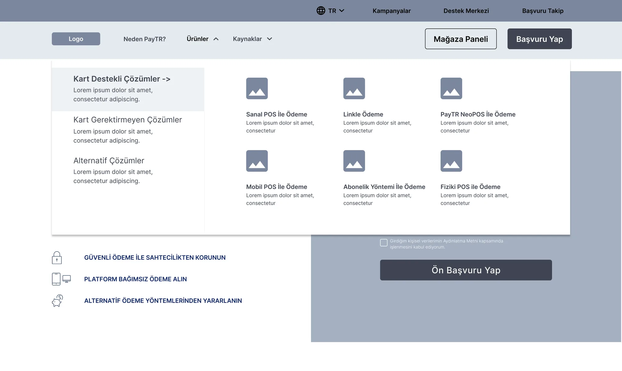
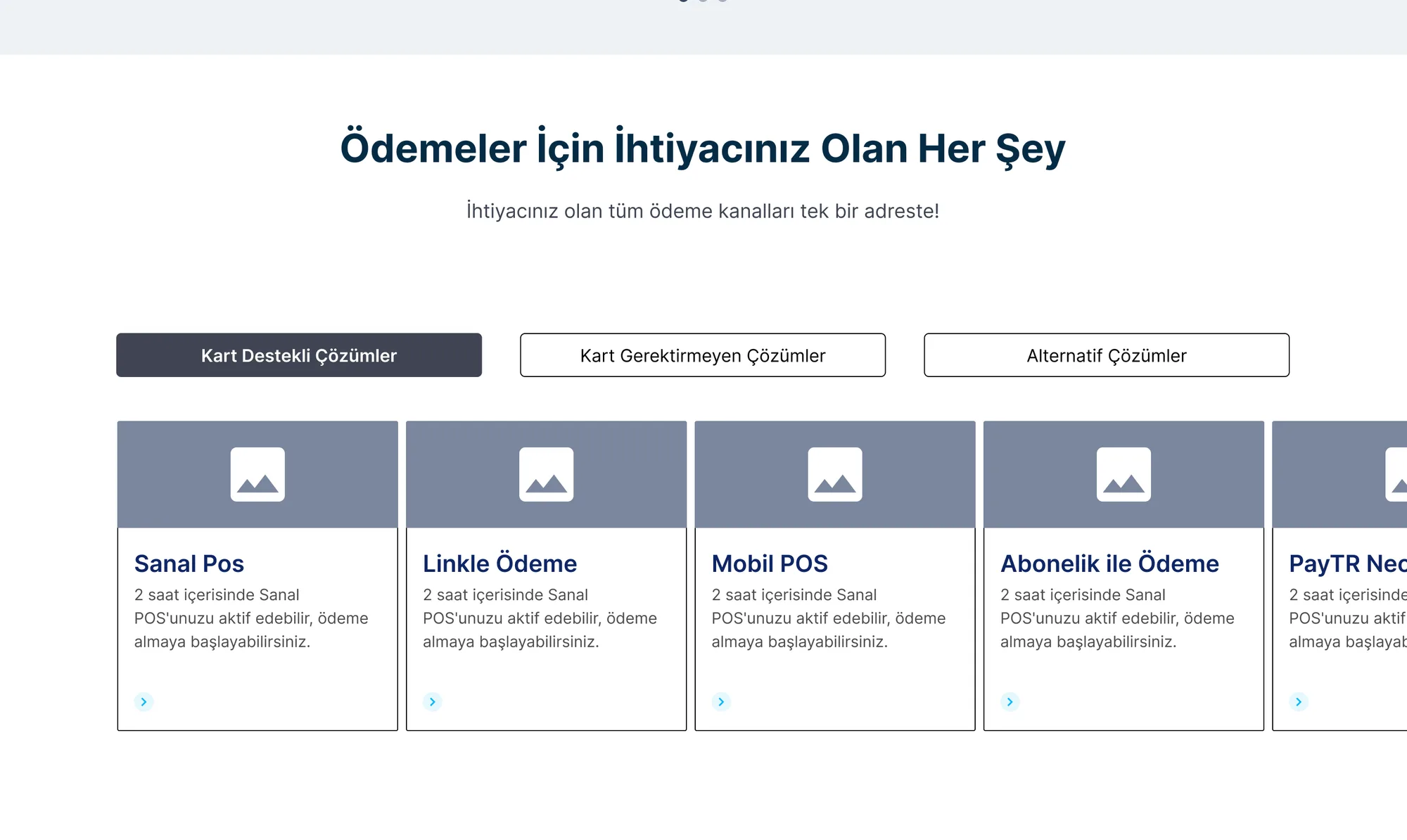
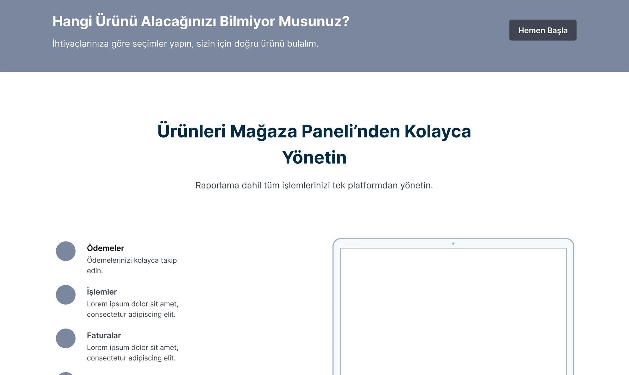
I designed the sitemap and mega-menu structure: I reduced scattered products into three clusters that match the user's mental model.
This is the heart of the work: each decision answers a problem, each answer has an impact. Not aesthetics — reasoning.
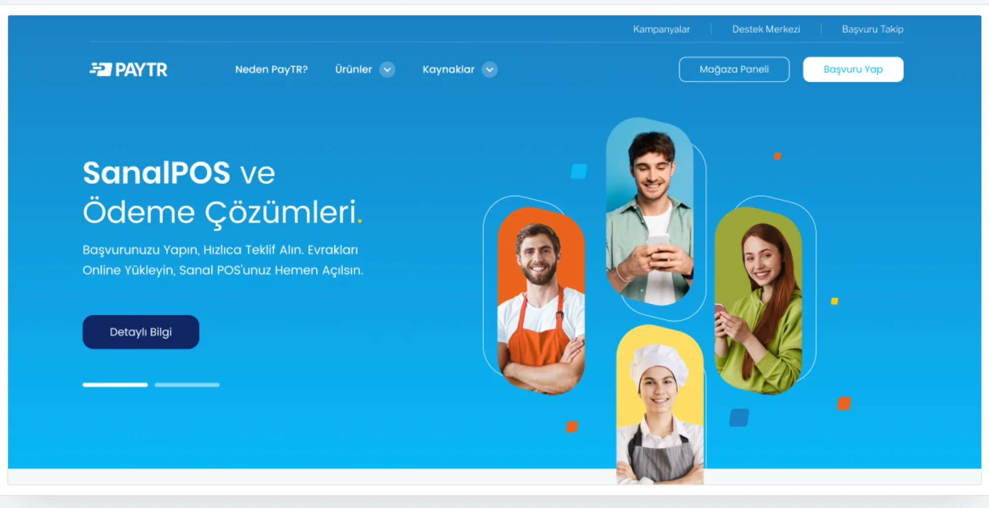
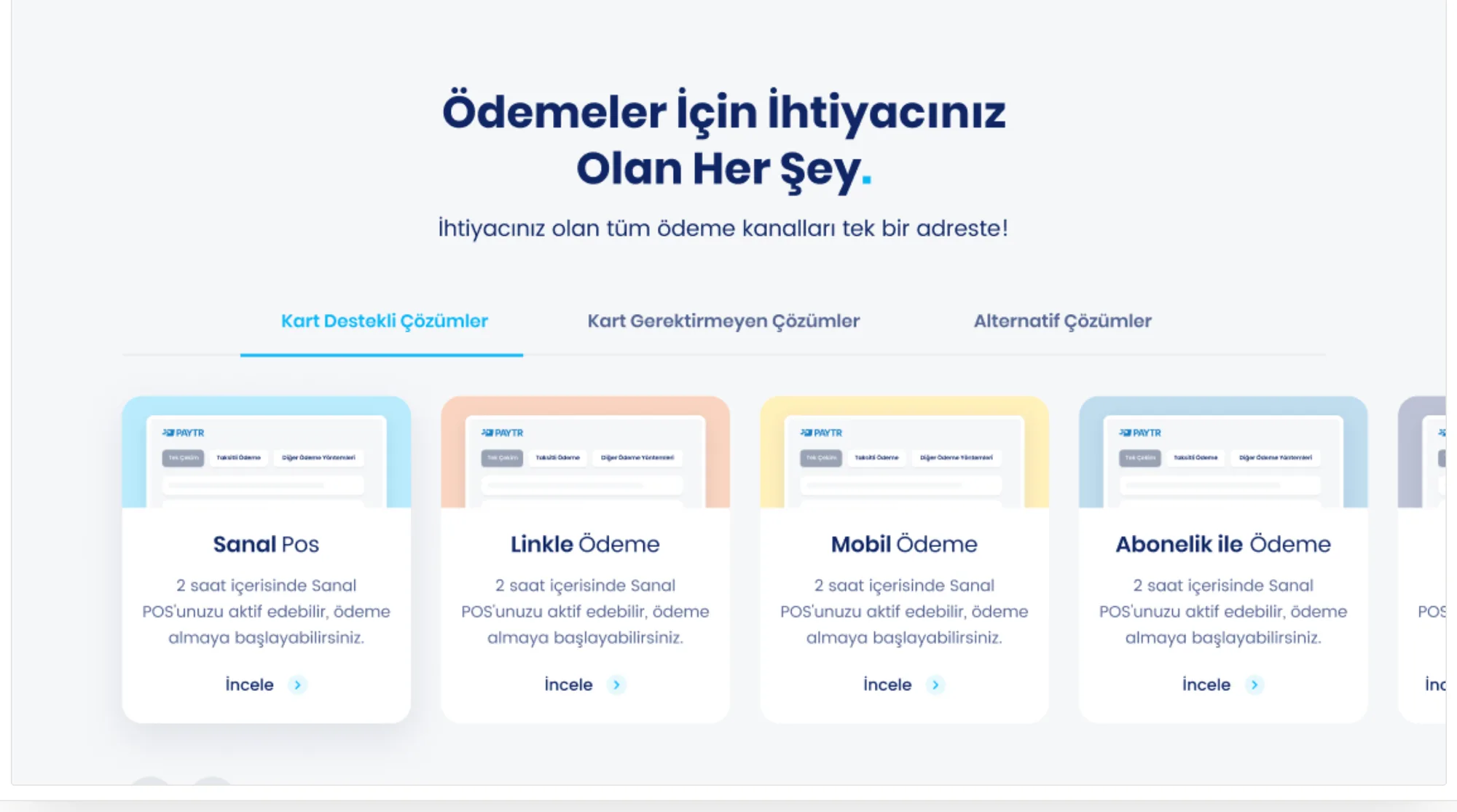
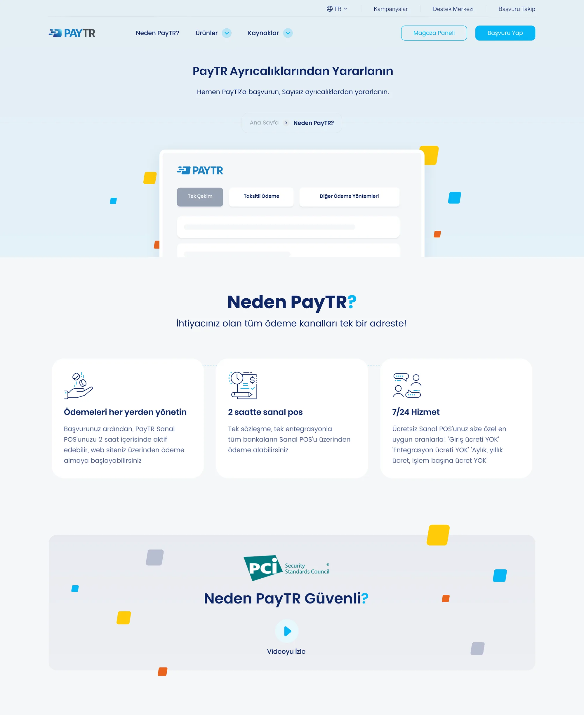
I made all three of these calls: I synthesized research findings, weighed the alternatives, justified my choice and implemented it in the UI.
I validated hierarchy and flow early with low-fidelity wireframes; the structure settled before colour and brand arrived.
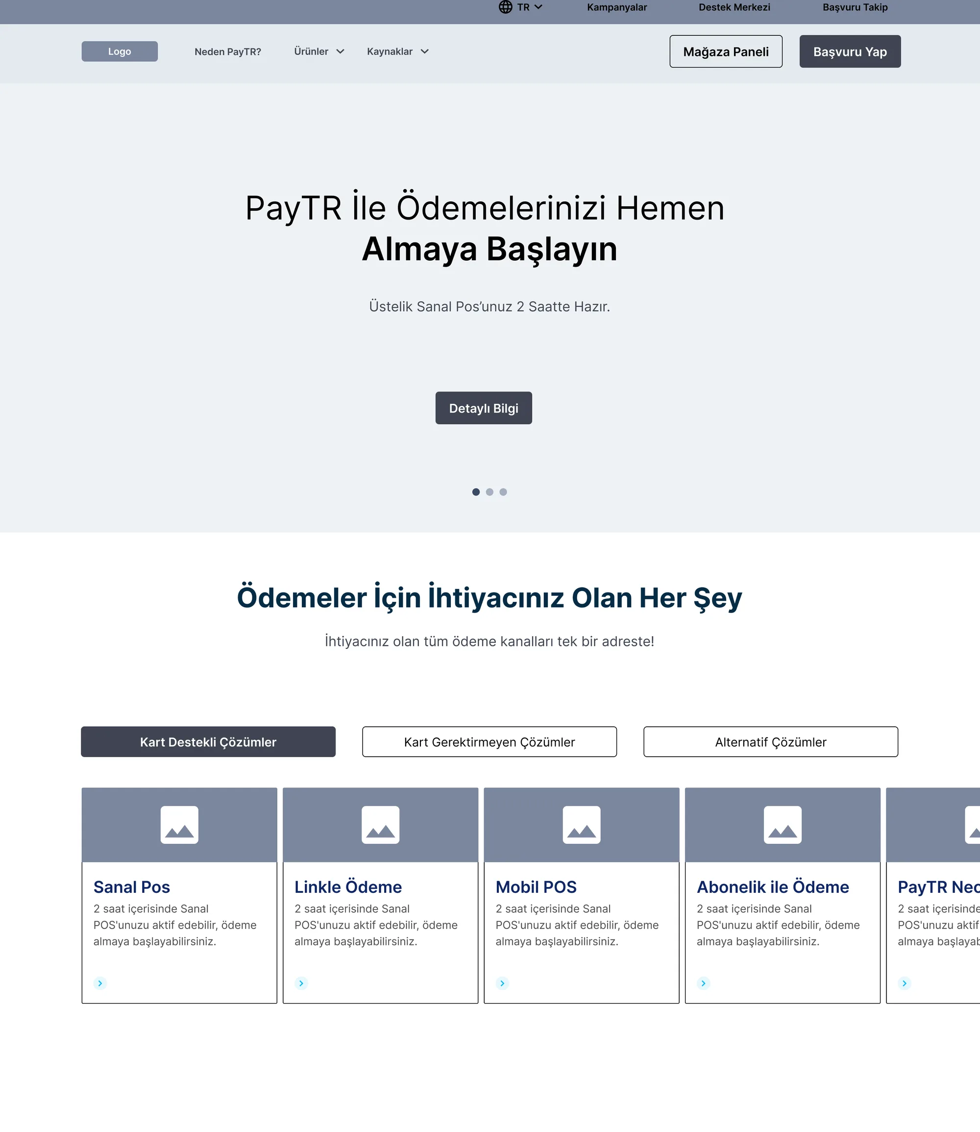
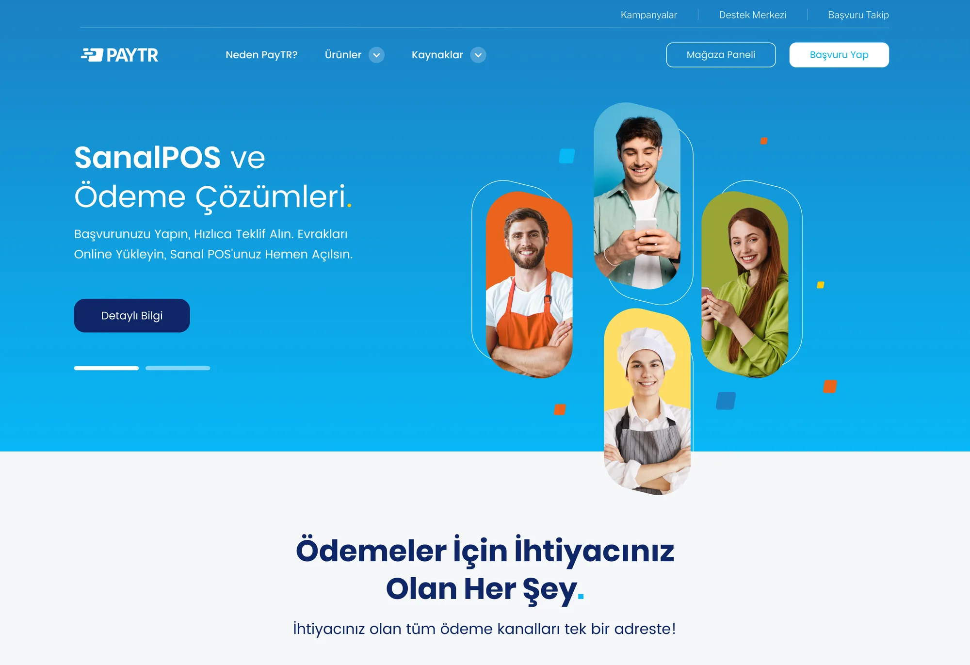
I drew the wireframes separately for desktop and mobile; I validated the structure before the brand arrived, so the visual layer amplified rather than rescued it.
With Poppins typography, PayTR's navy–blue axis and vivid accent colours, I built a component library that behaves consistently across all pages.
I built this design system from scratch: I defined the tokens, grid, spacing scale and the responsive rules for every component (buttons, cards, forms, states).
I designed mobile-first: the rich comparison blocks on desktop stack legibly on mobile, touch targets grow, and the priority message (security + speed + apply) is the first thing seen at every screen size.
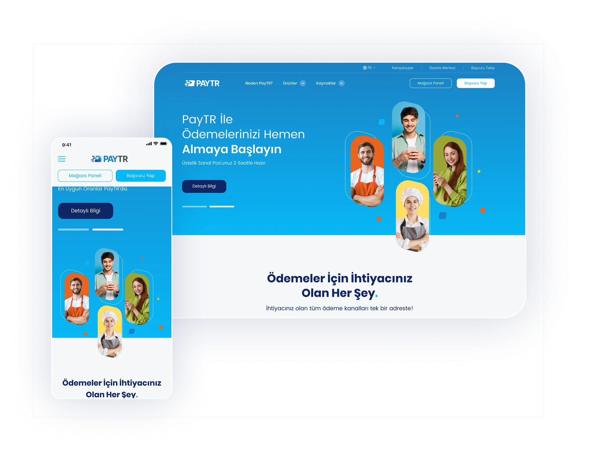
I defined the breakpoint rules: comparison cards sit side-by-side on desktop, drop to 2-up on tablet and a single column on mobile; the priority message and apply CTA stay the first thing seen at every size.
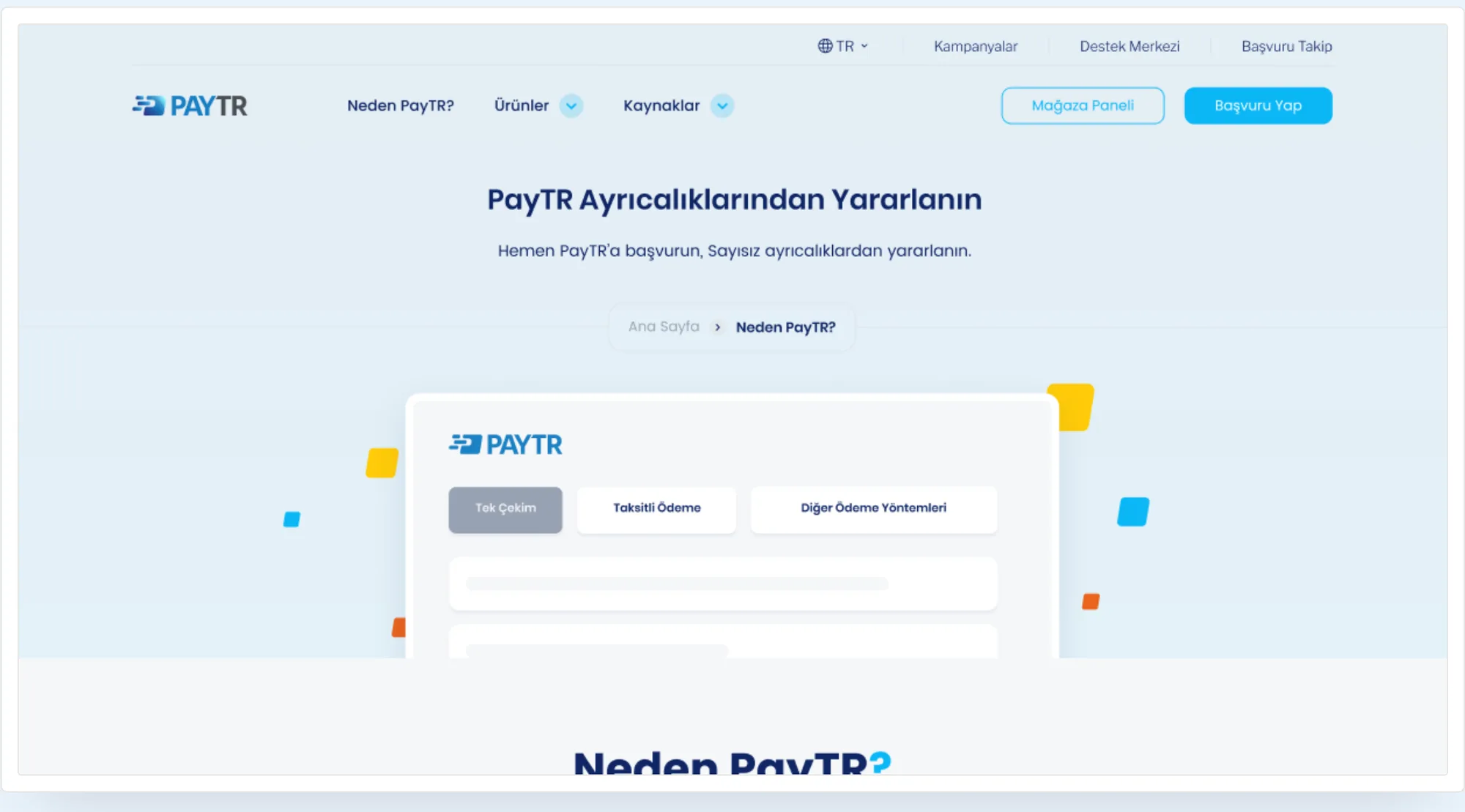
In fintech, trust isn't a layer you add later — it's the product's first sentence.
The decision I'm proudest of was moving security out of the fine print and into the hero — not a hunch, but the answer to a complaint I heard again and again in the netnography. If I started over, I'd negotiate the timeline earlier to make room for primary interviews, and validate what netnography surfaced with real users before launch.
Simplification must not weaken the trust message; the two aren't competitors.
Since objections arise throughout the decision, trust must be accumulated by repetition.
Treating the new brand identity as a compass rather than a constraint sped up building a consistent system.