Portfolio·Works·Eczacıbaşı

Eczacıbaşı Workflow Platform

Enterprise SaaS Workflow B2B · White-label Research-led

I redesigned the B2B workflow platform that runs companies' expense, purchasing and travel processes, end to end. The goal: make starting and tracking a workflow something no employee has to learn.

Role
UX Research & Product Design
Platform
Web · Mobile · Tablet
Industry
Enterprise SaaS · Workflow
01IMPACT & OUTCOMES

From a tool you had to learn, to a flow that explains itself.

0
Participants
I ran in-depth interviews with 15 users across 5 teams; every design decision rests on those findings.
0
Workflows
I unified 17 different flows — including expense, purchasing and travel — into one consistent system.
0+
Screens
I designed 120+ screens for desktop, tablet and mobile — as a white-label system that adapts to each company.
In-depth research Information architecture redesign White-label design system Role-based experience
02PROBLEM

A powerful platform you couldn't use without learning it first.

I had to solve these within the following constraints
17 flows 120-screen cap White-label Role-based visibility

Employees didn't know where to start a workflow, where they were stuck, or whom to ask — the power was inside the product but invisible in the interface.

Business Goal

The white-label platform had to be adopted with equal quality at every company, while cutting support load and training needs.

User Problem

Users couldn't answer 'which flow do I start, what stage am I at, why am I waiting?' — and went to the support line when stuck.

Design Challenge

Simplifying 17 flows and role-based visibility into one consistent system that still adapts to every company.
What I started with, where I took it
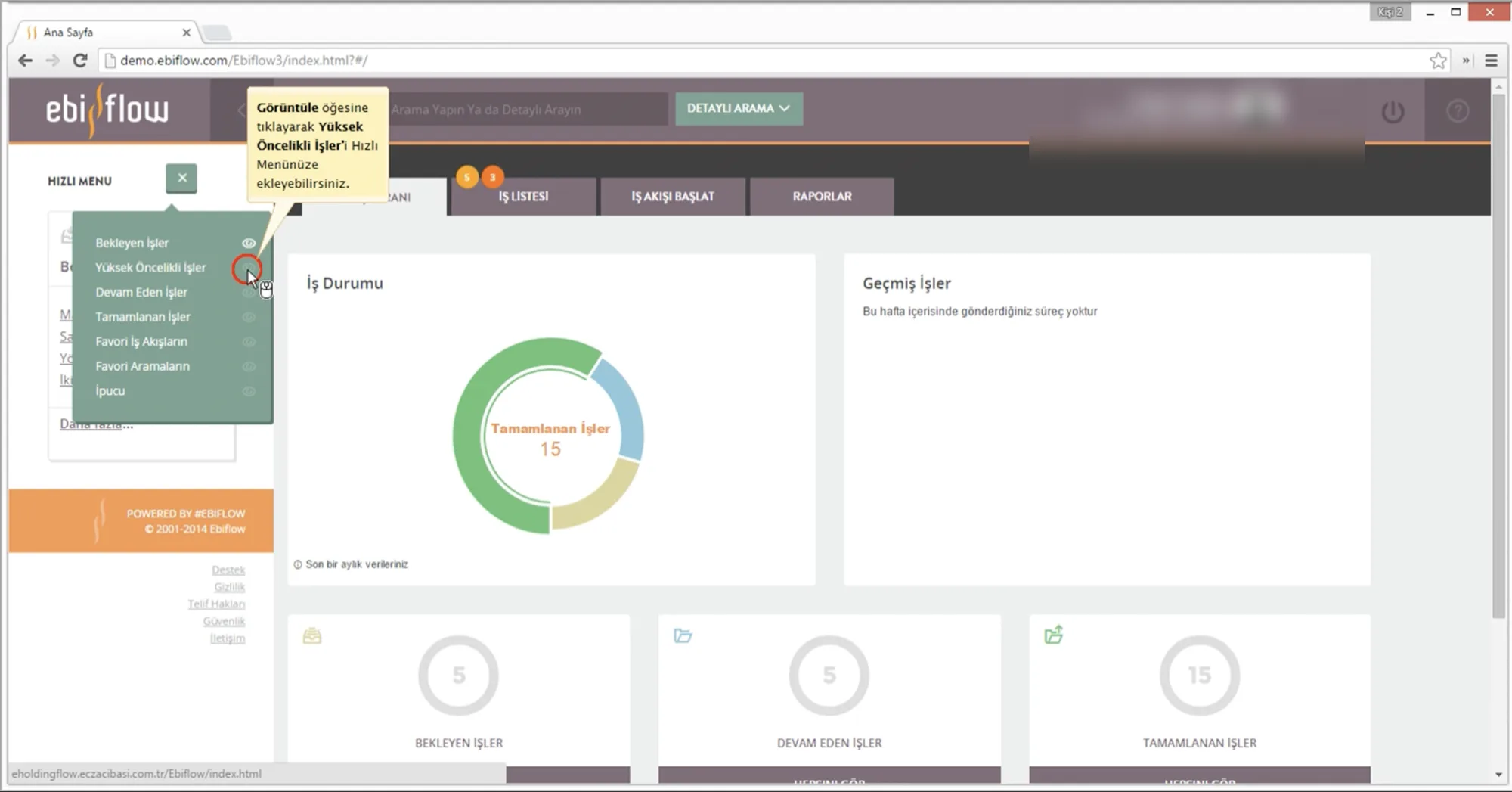
Ebiflow — Önceki arayüz

Before

Problem
Dense menus, unreadably small type, and status crammed into a single chart. Users couldn't see where to start a workflow or which step it was waiting on.
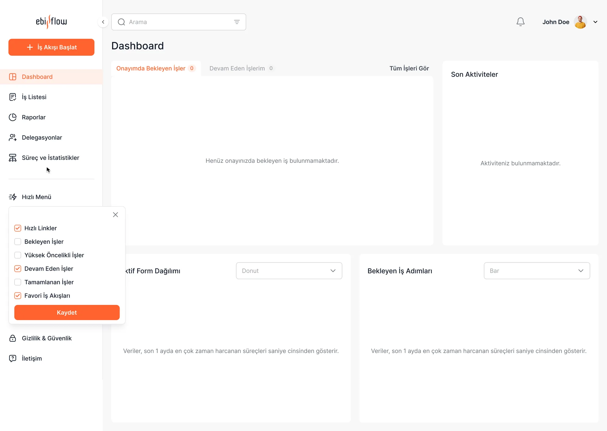
Ebiflow — Yeni arayüz

After

What changed & why
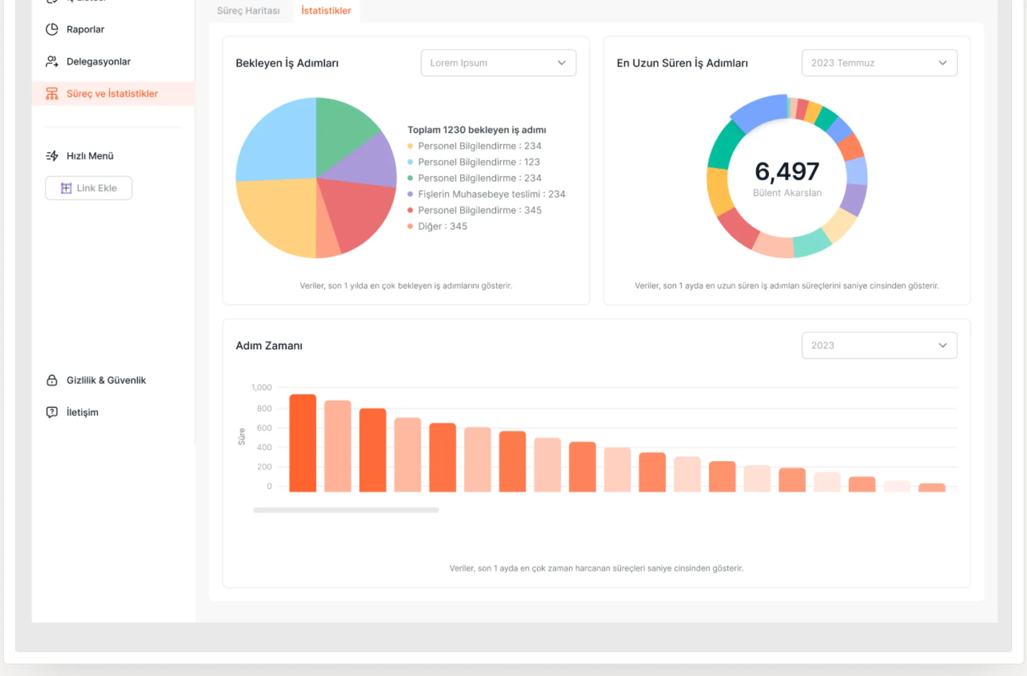
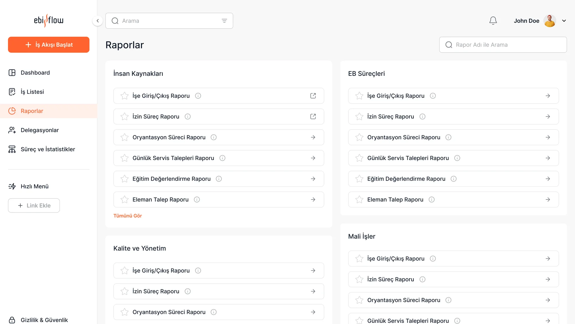
The most-used flows moved onto the dashboard (so you know where to start), a status backbone shows which step each item is at and who it waits on, and reporting moved inside the interface — each one answering a specific research finding.
03RESEARCH

I listened before I designed.

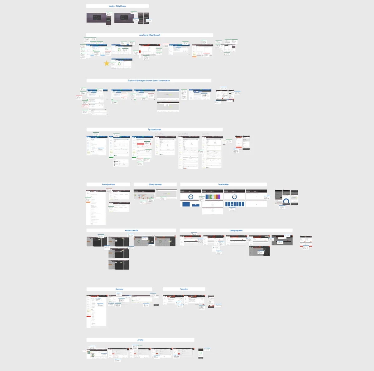
I used nearly every research method here: expert review, data analysis, internal stakeholder interviews and in-depth user interviews. The goal wasn't to assume the pain points — it was to prove them.
Uzman Analizi
Expert Review
I audited the platform against heuristic metrics, mapping gaps in learnability, feedback and error prevention screen by screen.
Heuristic metrics + a screen-by-screen findings map
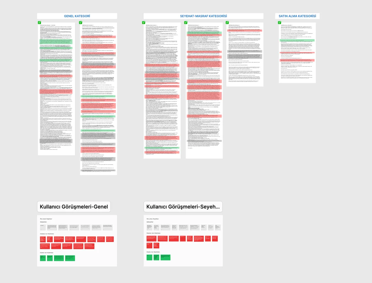
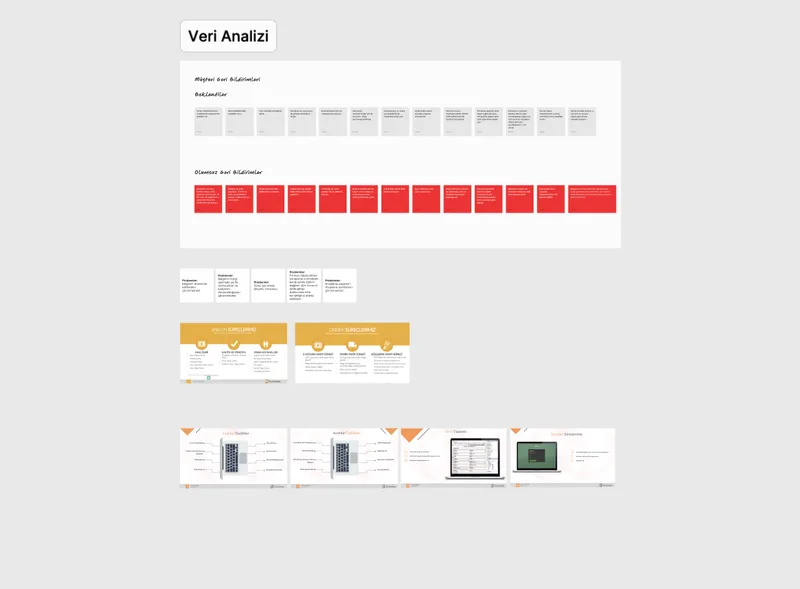
Veri Analizi
Data Analysis
I coded existing customer feedback as positive/negative and quantified the most repeated complaints and expectations.
A coded feedback wall — expectations vs. negatives
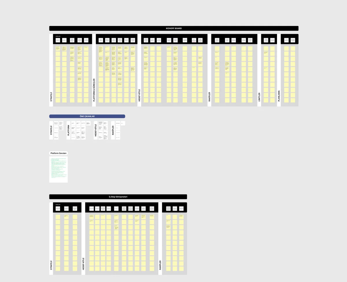
Kickoff & İç Ekip Görüşmeleri
Kickoff & Stakeholder Interviews
With product, engineering and marketing I mapped strategy, audience, competitors and limits — technical constraints were clear before design.
Strategy · Audience · Competitors · Limits board
Derinlemesine Görüşmeler
In-depth Interviews
I ran 45–60 minute semi-structured interviews with 15 users, coding the transcripts by category to surface themes.
Transcripts coded by category
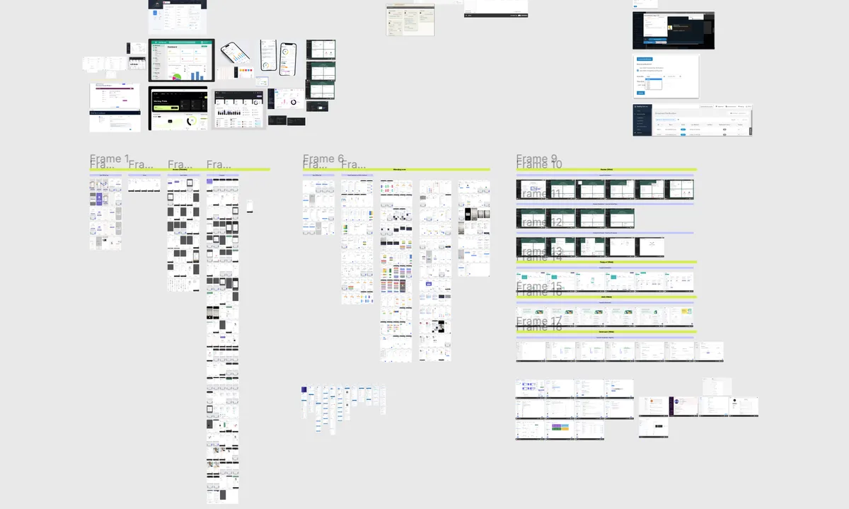
Benchmark
Competitive Benchmark
I studied workflow and task-management products to see which patterns had become expectations and where we could differentiate.
Flow and dashboard patterns across competitors
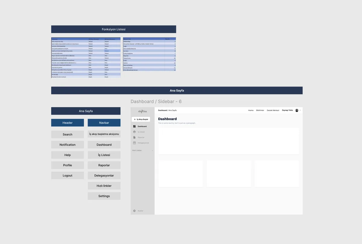
Blueprint & fonksiyon listesi
Synthesis & Strategy
I merged every finding into one theme map, aligned the function list and design strategy with the client, and moved into wireframes.
Findings → function list → design strategy
Participant segments — I heard each process from the people who live it
6
General Users
White-collar employees using the platform in daily routine work.
3
Expense Process
Users entering spend and waiting for approval.
3
Purchasing
Those raising requests and tracking the procurement flow.
3
Travel Process
Those planning business travel and reporting its costs.
The four findings the research surfaced
My role

I ran the research end to end: I wrote the interview guide, moderated the sessions with 15 participants, then synthesized the findings into the design strategy.

04BUSINESS GOALS

The goals the design served.

I tied the research findings to four business goals; every design decision had to serve one of them.

05USER TYPES

One platform, three different needs.

In Ebiflow not everyone sees the same screen: role determines both what you can do and what you can see. The interviews surfaced three clear profiles.

Eczacıbaşı EBIFlow — Kullanıcı tipleri

The Requester

Enters expenses, plans travel, raises purchase requests. Needs: find the right flow fast and see where it stands. No approval rights.

The Approver

Approves pending items and reviews reports. Needs: a prioritized pending list and bulk action.

The Process Owner (Finance / HR)

Tracks their unit's flow end to end. Needs: filterable views and reporting inside the interface.

06USER FLOW & INFORMATION ARCHITECTURE

From starting to approval, one backbone.

All 17 flows shared the same five steps. I extracted that backbone and mounted every process on it — learn one flow and you've learned the other sixteen.

01
Start
Picks the right flow from the dashboard in one step.
02
Fill
Completes the request form with context-aware fields.
03
Track
Sees which step it's at and who it's waiting on.
04
Approve
The manager approves pending items by priority.
05
Report
The outcome is reported in-app, not exiled to Excel.
Ebiflow Workflow Platform
Workflows
  • Expense Process
  • Purchasing
  • Travel Process
Task List
  • Pending
  • In Progress
  • Completed
Reports & Support
  • Reports & Charts
  • Search & Filter
  • Onboarding & Help
My role

I decomposed all 17 flows to extract the shared backbone, and defined the sitemap and role-based visibility rules myself.

07DESIGN DECISIONS

Why I made these decisions.

Each decision answers a research finding. Not aesthetics — reasoning.
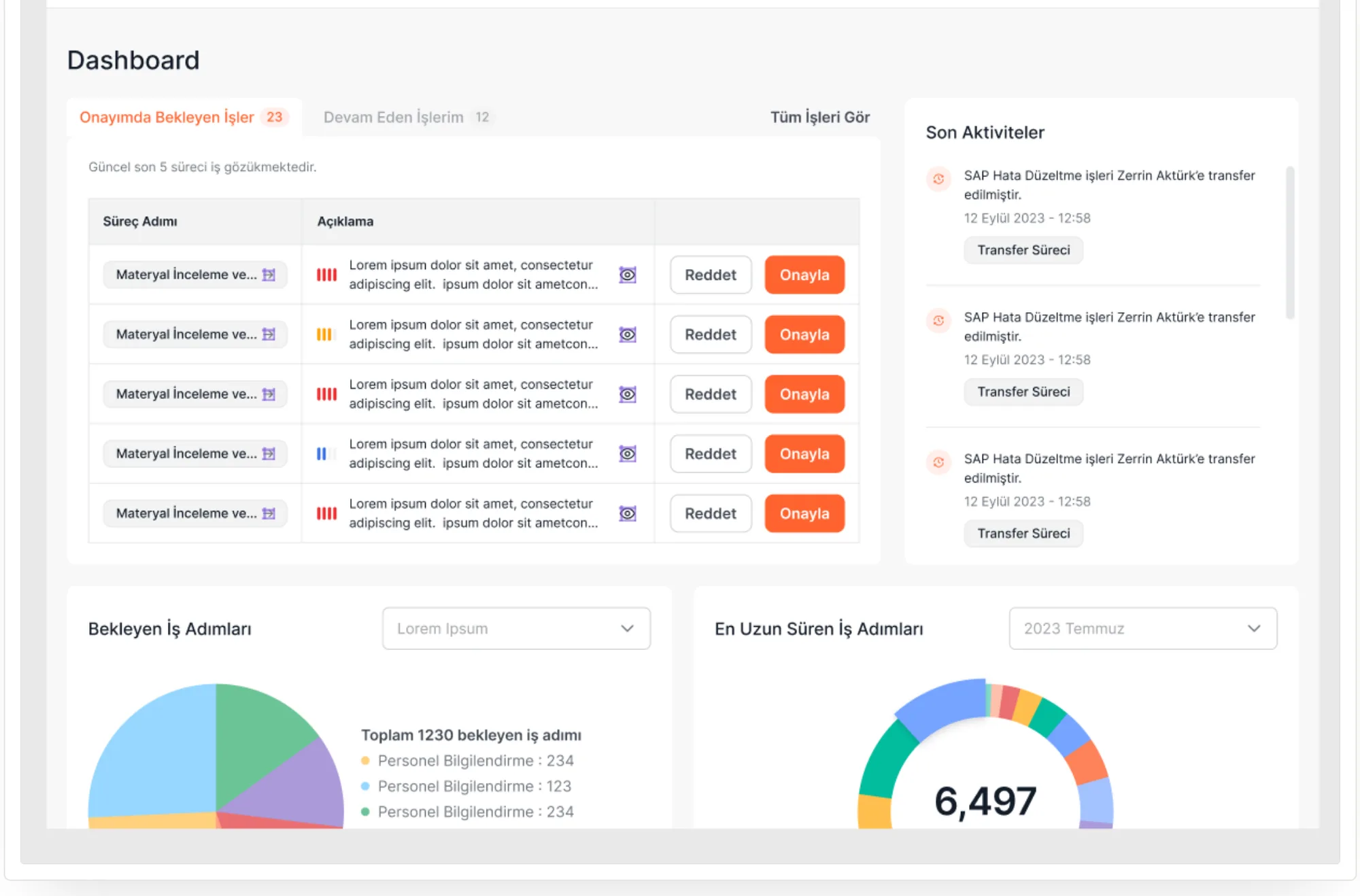
Ebiflow — Ana ekran
01Making workflows startable from the dashboard
Problem
Users couldn't find the right one among 17 flows and asked colleagues instead.
Alternatives
(a) A deep flow list in the menu, (b) a search box, (c) starting the most-used flows directly from the dashboard.
Why this
(c): Data showed a handful of flows drive most usage. Search doesn't help someone who doesn't know what to search for.
Result
'Where do I start?' is answered on the dashboard, in one click.
Ebiflow — İş takibi
02A status backbone that makes the process visible
Problem
Users couldn't see which step a flow was at or who it awaited; uncertainty turned into support tickets.
Alternatives
(a) A status label only (Pending/Approved), (b) email notifications, (c) step-by-step progress plus who it's waiting on.
Why this
(c): The question wasn't 'is it approved' but 'where is it stuck and whom do I chase'. A label can't answer that.
Result
Uncertainty is gone; users look at the interface instead of the support line.
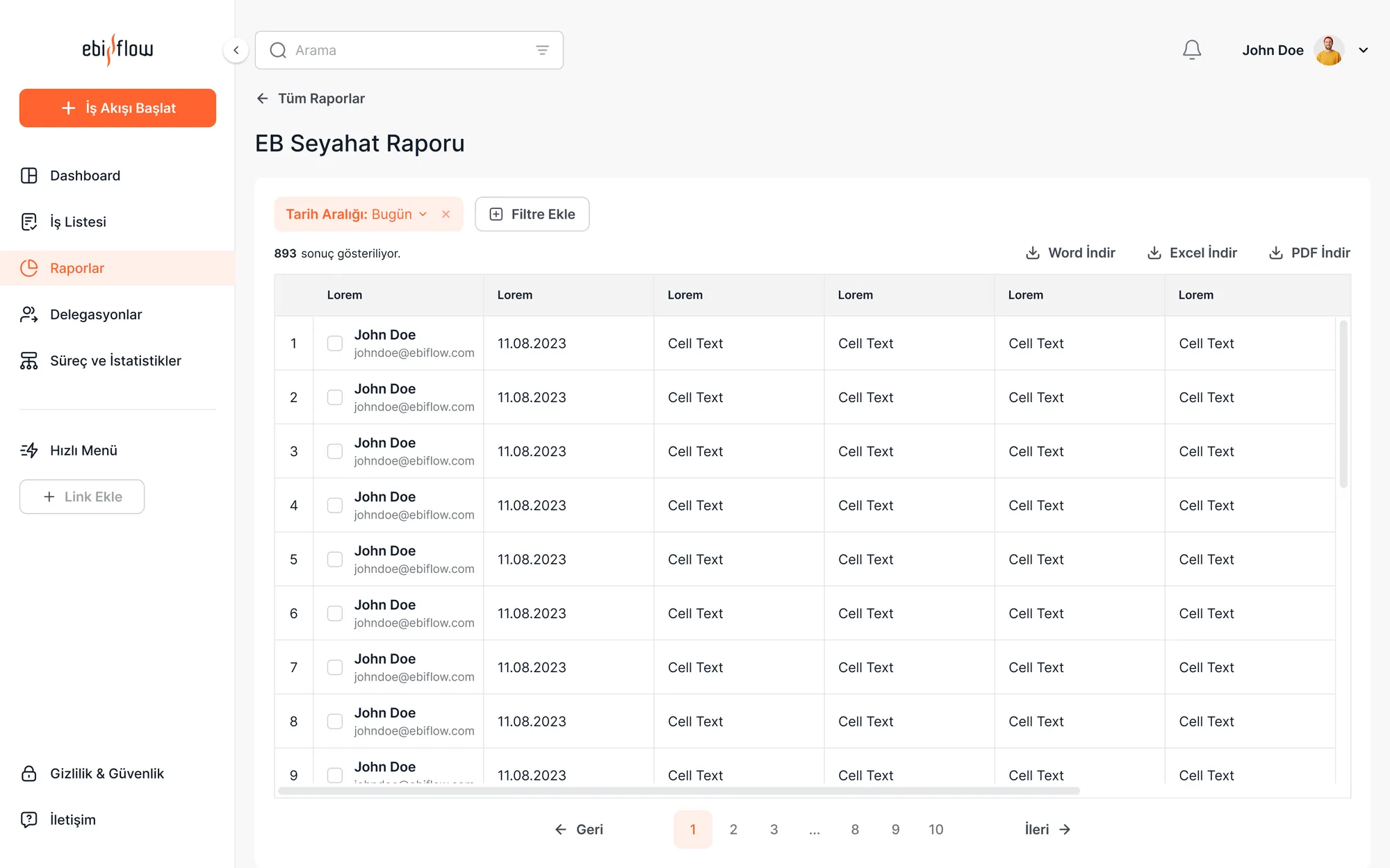
Ebiflow — Raporlama
03Bringing reporting back from Excel into the interface
Problem
Managers exported reports to Excel — the product's most valuable output was leaving the interface.
Alternatives
(a) Improve the Excel export, (b) a static report page, (c) a filterable, charted live reporting screen.
Why this
(c): Exporting to Excel wasn't a solution, it was an escape. The decision should happen inside the product.
Result
Managers gained live visibility; reporting is now part of the product.
My role

I made all three calls: I synthesized the research, weighed and justified the alternatives, and implemented them in the UI.

08WIREFRAMES

From skeleton to final design.

I validated the structure before brand and colour arrived: within a 120-screen cap, we decided what information sits where at the wireframe stage.
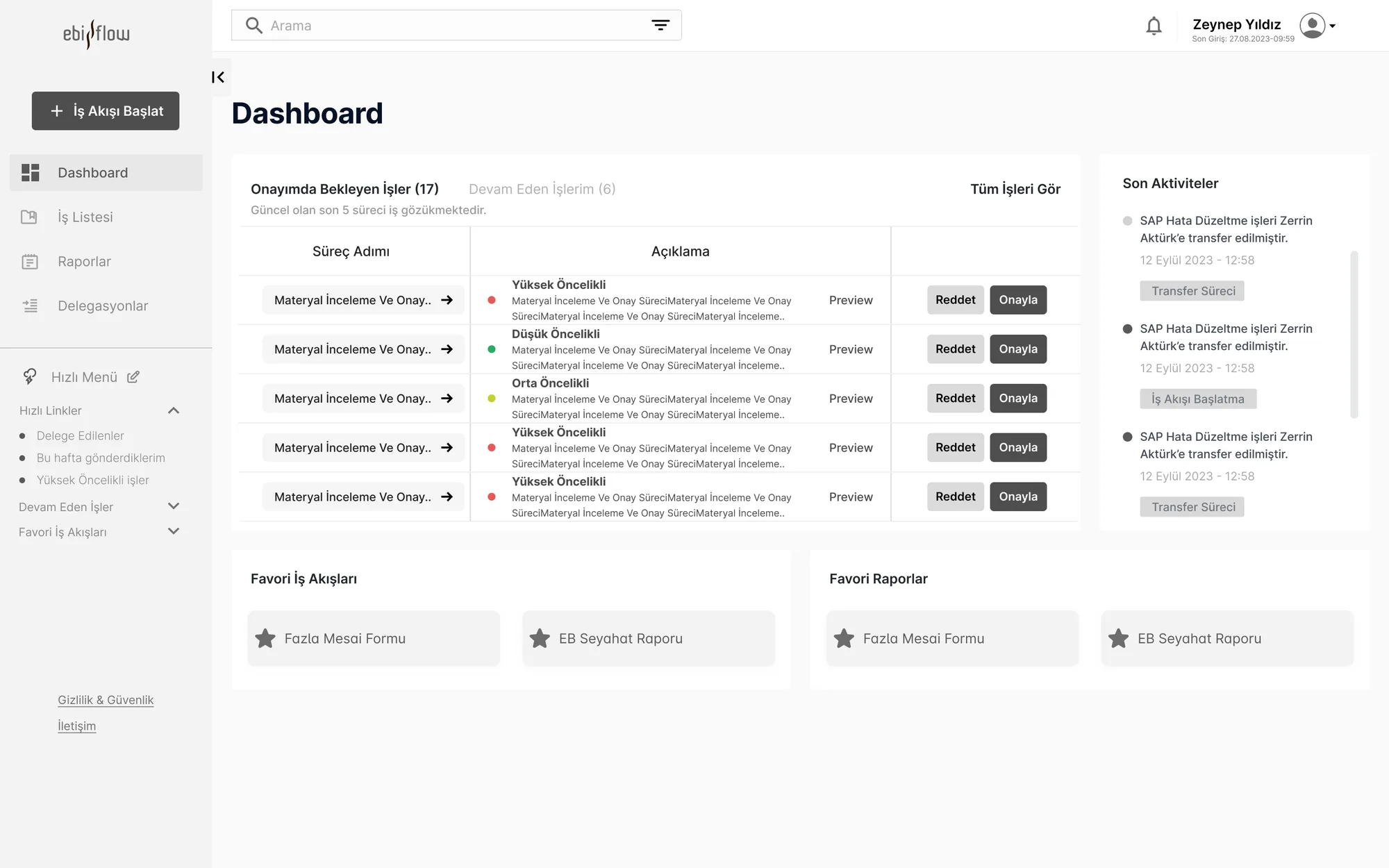
Ebiflow — Ana ekran wireframe

Wireframe

Intent
Validating hierarchy, flow and role-based visibility before colour.
Ebiflow — Final tasarım

Final Design

What changed
The same skeleton, brought to life with the white-label design system and the status backbone.
09DESIGN SYSTEM

One system that can wear any company's identity.

Because the platform is sold white-label, I built the design system on tokens: colour, logo and typography change per company while component behaviour stays fixed.

Aa
InterCorporate, neutral — a base that adapts to any brand
#E8552F
#F2994A
#1A2433
#2BB673
#EB5757
COMPONENTS, GRID & STATES
Buttons
Start Workflow Approve Details Disabled
Cards
Expense Request
Awaiting approval — step 2 of 4
Pending
Travel Form
Completed — visible in reports
Completed
Forms & States
Expense amount Select cost centre Receipt missing
Default Focus Approved Rejected
Grid & Spacing
12-column grid · 4px-based spacing scale · tokens change per company.
My role

I built the token-based white-label system from scratch: I defined the grid, spacing scale, component library and the per-company customization rules.

10RESPONSIVE STRATEGY

Manage on desktop, approve on mobile.

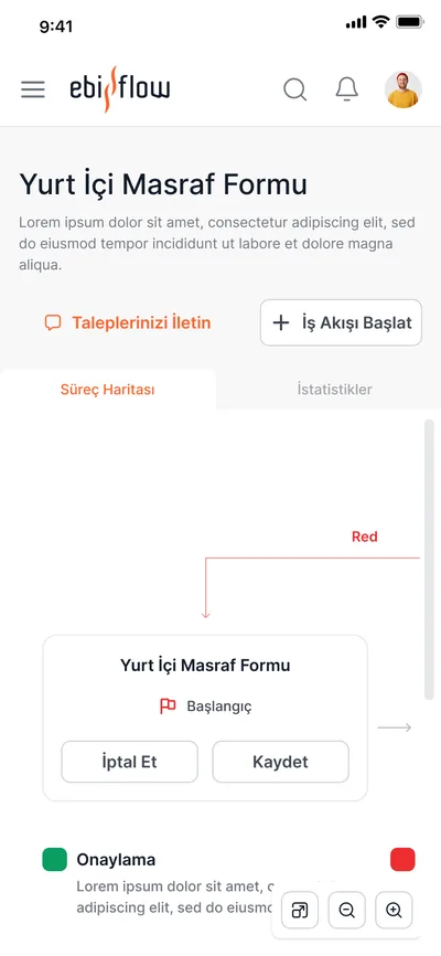
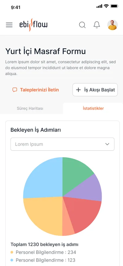
Research showed a clear split: long forms get filled on desktop, approvals happen on the phone. So I designed mobile not as a shrunken desktop but as a surface focused on approval and tracking.
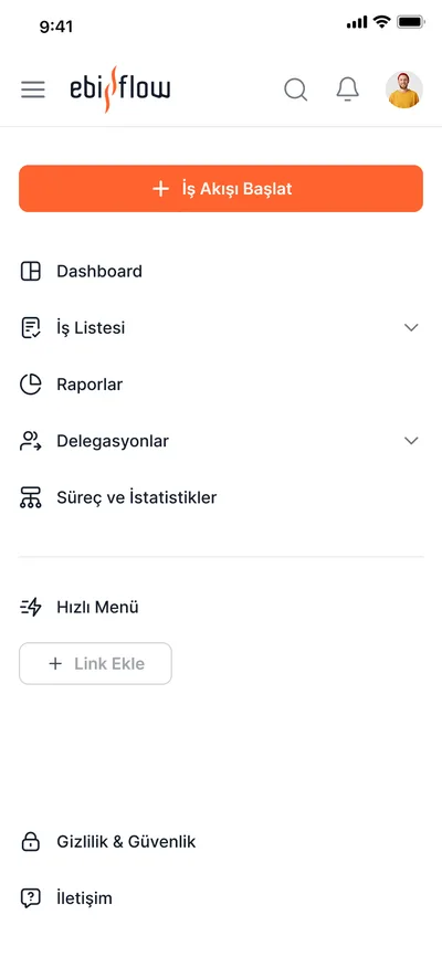
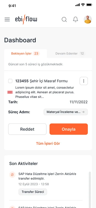
Ebiflow — Mobil ana ekran
Ebiflow — Mobil iş listesi
Ebiflow — Mobil onay
Ebiflow — Mobil detay
Mobile — not for filling forms, but for approving and tracking
My role

I grounded the breakpoint rules in the research: on mobile the priority isn't filling forms, it's approving pending items and tracking progress.
11FINAL UI

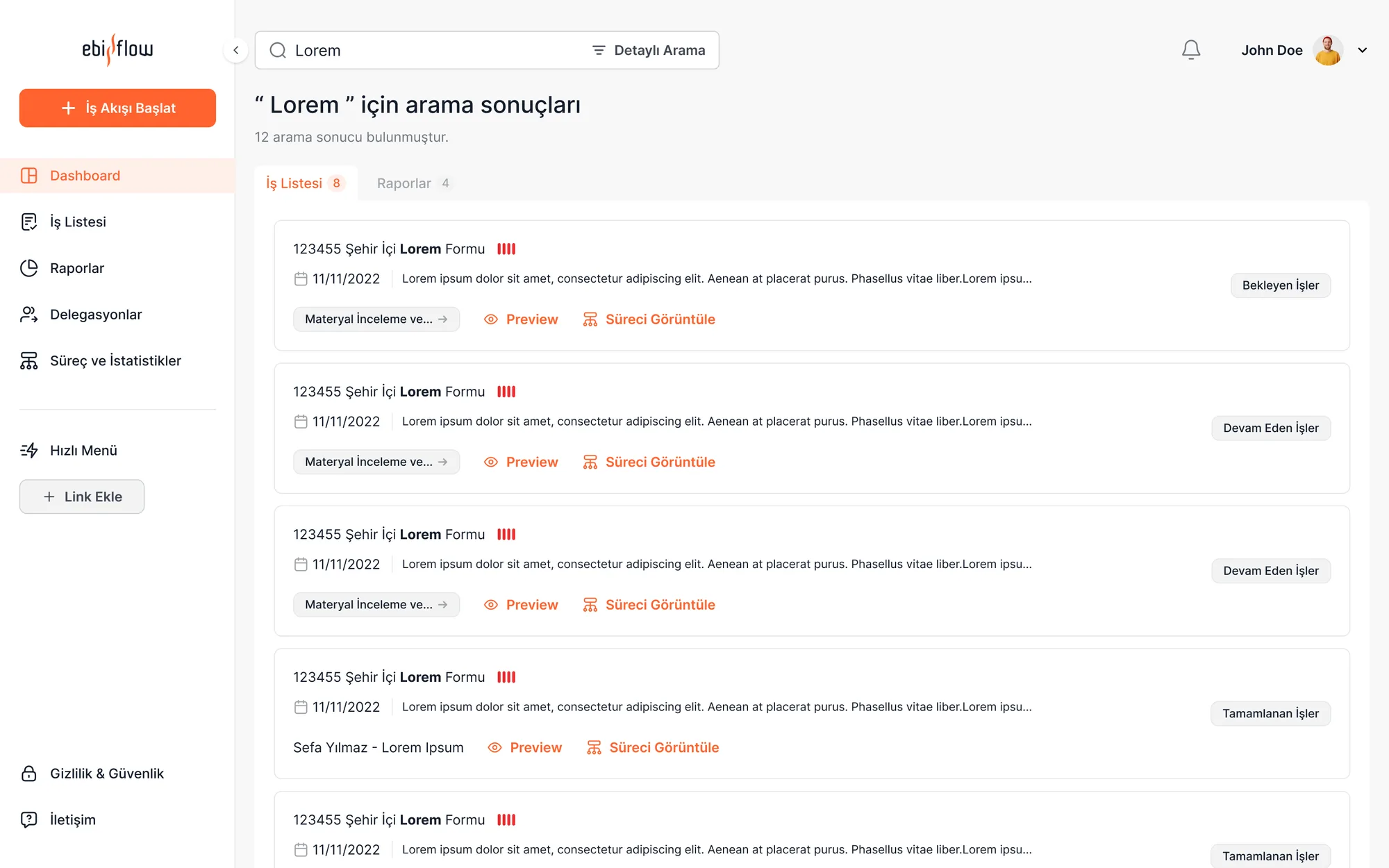
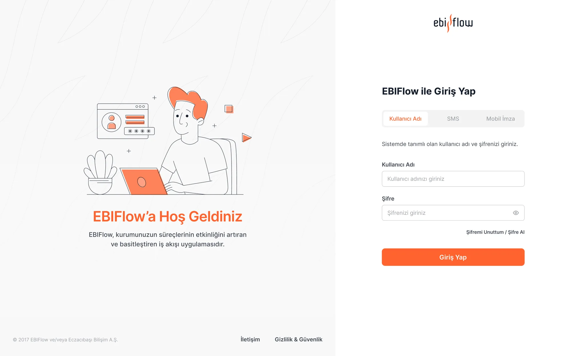
Screens from the live product.

Ebiflow — Ana ekran
Ebiflow — İş listesi
Ebiflow — Raporlar
Ebiflow — İş akışı detayı
12REFLECTION & LESSONS LEARNED
"

In an enterprise product, the most expensive thing is a user looking around asking 'who do I ask?'

The decision I'm proudest of was finding the backbone shared by all 17 flows and mounting everything on it — learn one flow and you've learned the rest. If I started over, I'd negotiate the research timeline earlier and add one more usability round after design to validate the findings.

01

Research changes the constraint itself

The 120-screen cap looked like a wall; once research said which 120 mattered, it became liberating.

02

Visibility comes before features

Users didn't want new features — they wanted to see where the existing process stood.

03

White-label means discipline

A system that wears any identity only survives if it's built on tokens and immutable behaviours.