Role
UX Research & Product Design
I redesigned the B2B workflow platform that runs companies' expense, purchasing and travel processes, end to end. The goal: make starting and tracking a workflow something no employee has to learn.
Employees didn't know where to start a workflow, where they were stuck, or whom to ask — the power was inside the product but invisible in the interface.
The white-label platform had to be adopted with equal quality at every company, while cutting support load and training needs.
Users couldn't answer 'which flow do I start, what stage am I at, why am I waiting?' — and went to the support line when stuck.
Simplifying 17 flows and role-based visibility into one consistent system that still adapts to every company.
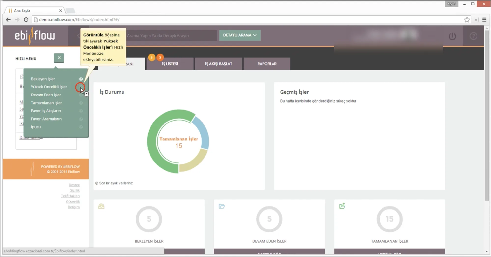
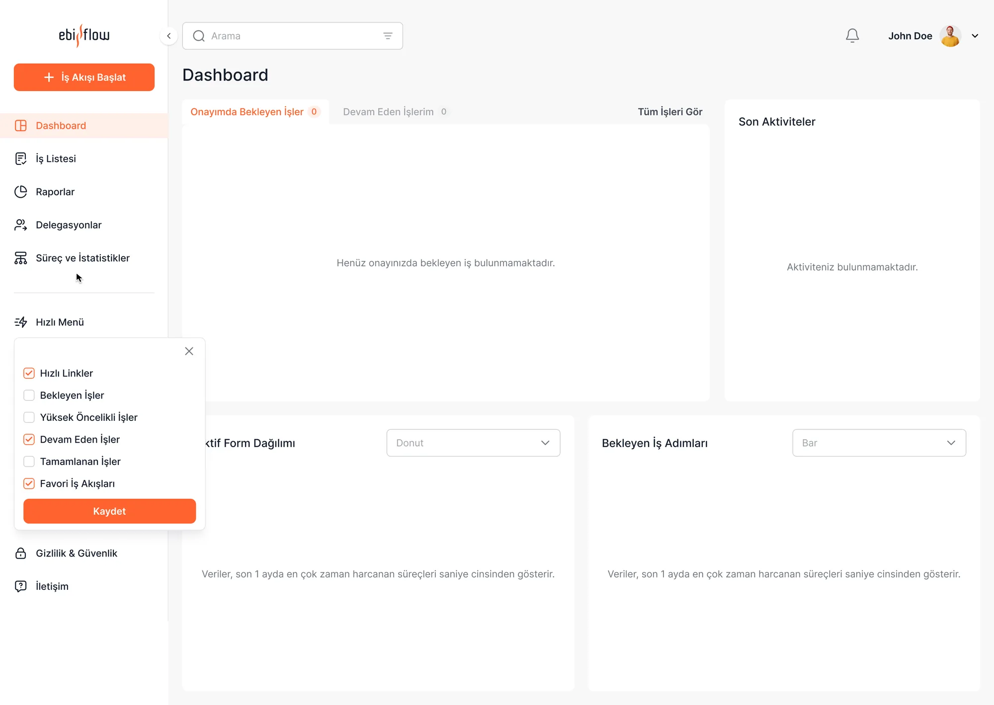
I used nearly every research method here: expert review, data analysis, internal stakeholder interviews and in-depth user interviews. The goal wasn't to assume the pain points — it was to prove them.
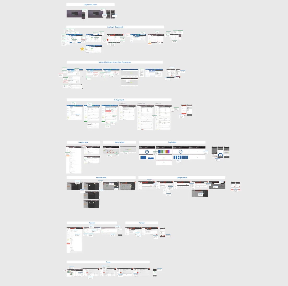
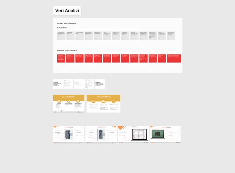
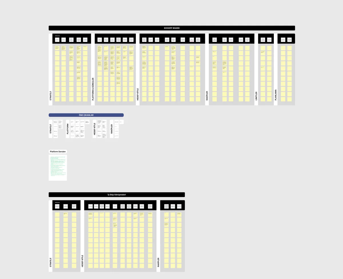
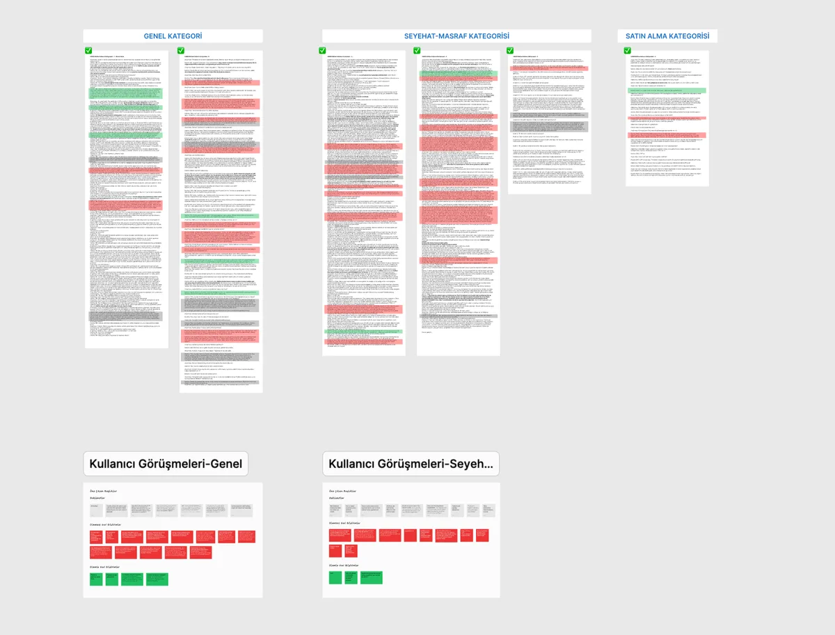
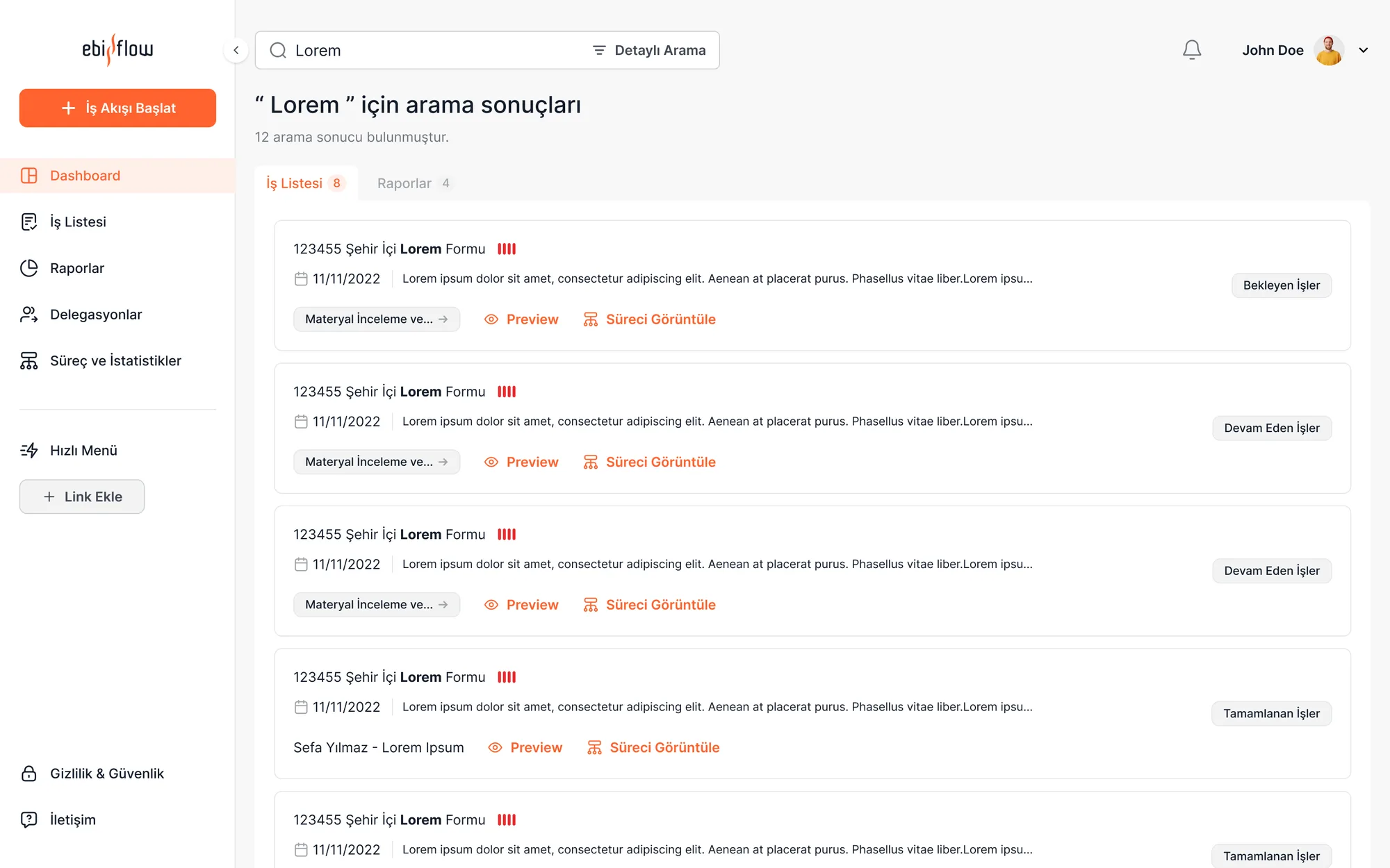
Users couldn't find the right one among 17 flows — most ended up asking a colleague.
They couldn't see which step their workflow was at or who it was waiting on; uncertainty was the loudest complaint.
Role-based visibility left users unaware of their own permissions; the need for onboarding was explicit.
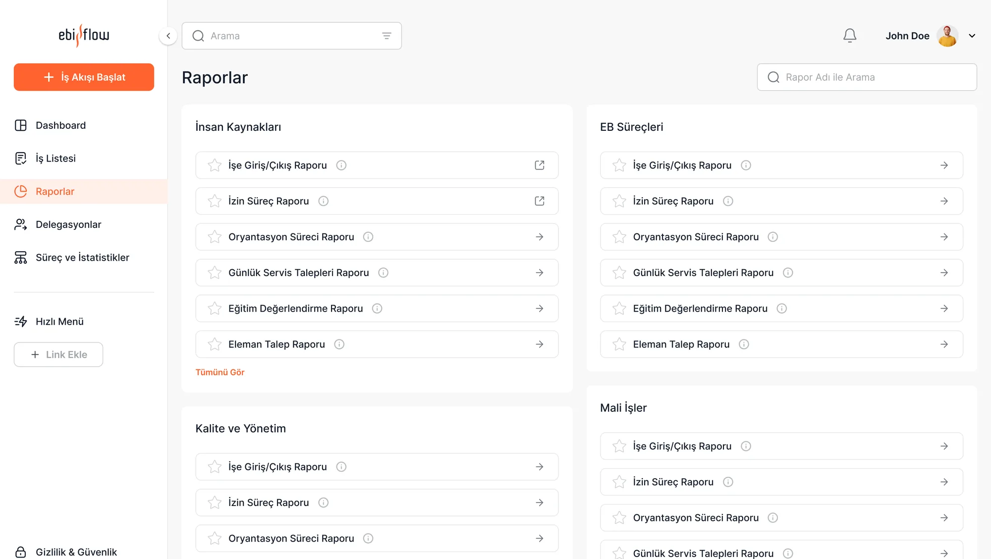
Managers exported reports to Excel to read them — the product's most valuable output was leaving the interface.
I ran the research end to end: I wrote the interview guide, moderated the sessions with 15 participants, then synthesized the findings into the design strategy.
I tied the research findings to four business goals; every design decision had to serve one of them.
An interface that explains itself, usable without training.
Answering 'where is it stuck?' in the interface, cutting support requests.
A white-label system, customizable per company, governed from one source.
Bringing reporting back from Excel into the interface, giving managers live visibility.
In Ebiflow not everyone sees the same screen: role determines both what you can do and what you can see. The interviews surfaced three clear profiles.

Enters expenses, plans travel, raises purchase requests. Needs: find the right flow fast and see where it stands. No approval rights.
Approves pending items and reviews reports. Needs: a prioritized pending list and bulk action.
Tracks their unit's flow end to end. Needs: filterable views and reporting inside the interface.
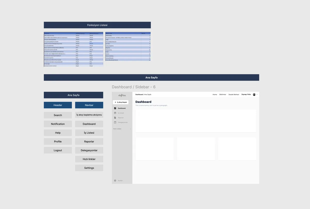
All 17 flows shared the same five steps. I extracted that backbone and mounted every process on it — learn one flow and you've learned the other sixteen.
I decomposed all 17 flows to extract the shared backbone, and defined the sitemap and role-based visibility rules myself.
Each decision answers a research finding. Not aesthetics — reasoning.
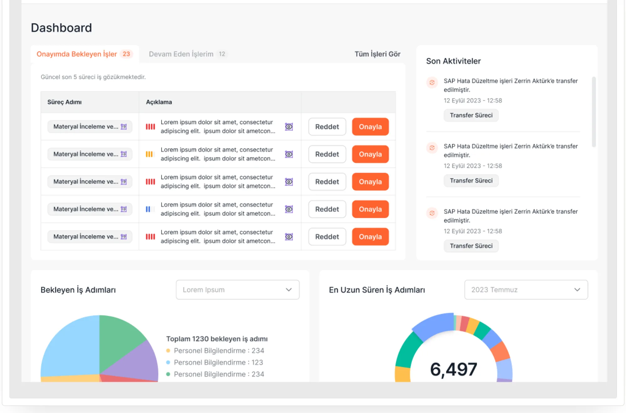
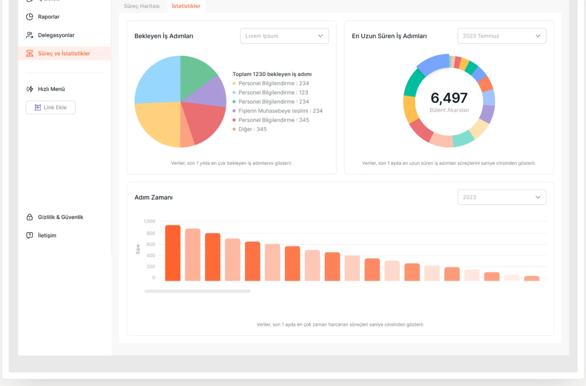
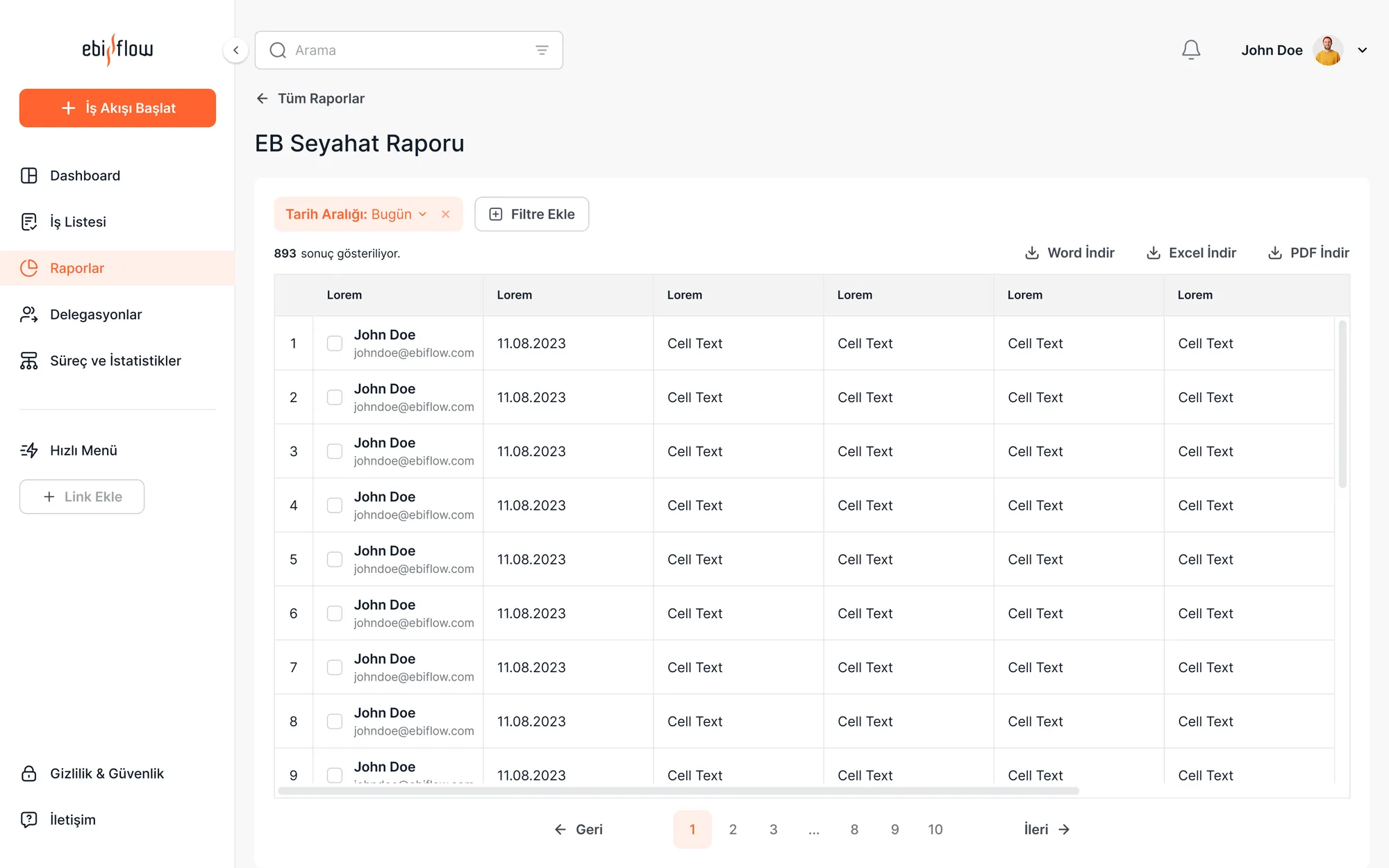
I made all three calls: I synthesized the research, weighed and justified the alternatives, and implemented them in the UI.
I validated the structure before brand and colour arrived: within a 120-screen cap, we decided what information sits where at the wireframe stage.
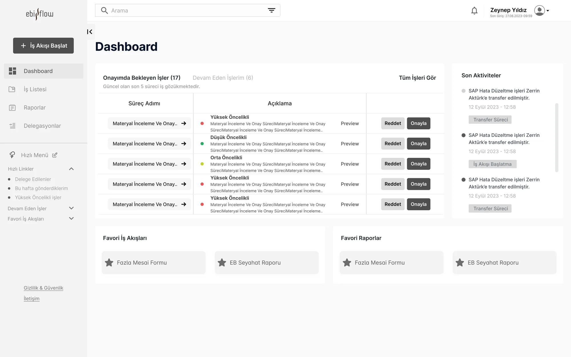
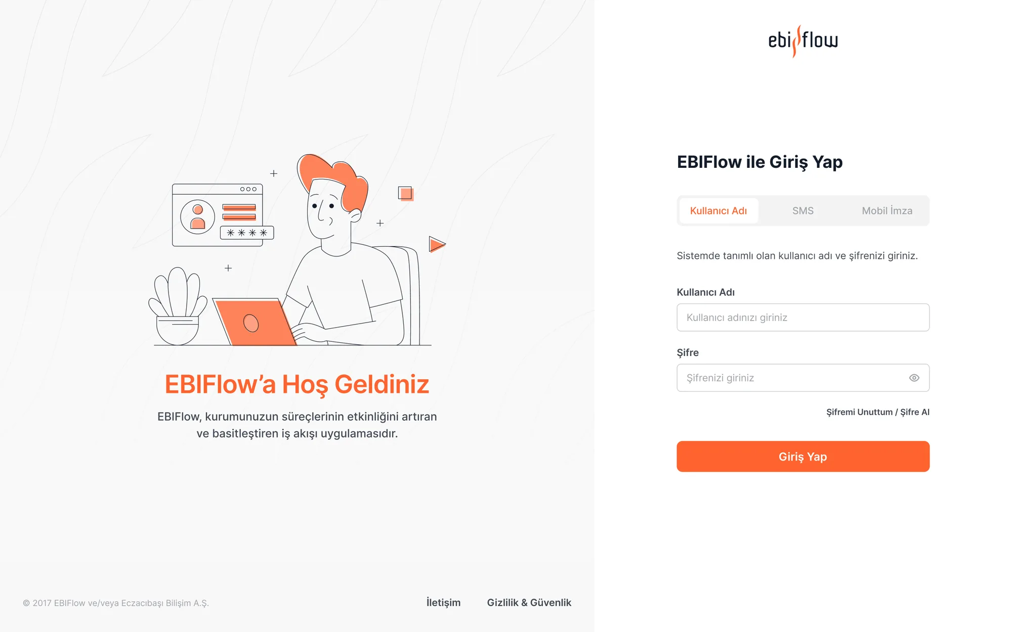
Because the platform is sold white-label, I built the design system on tokens: colour, logo and typography change per company while component behaviour stays fixed.
I built the token-based white-label system from scratch: I defined the grid, spacing scale, component library and the per-company customization rules.
Research showed a clear split: long forms get filled on desktop, approvals happen on the phone. So I designed mobile not as a shrunken desktop but as a surface focused on approval and tracking.
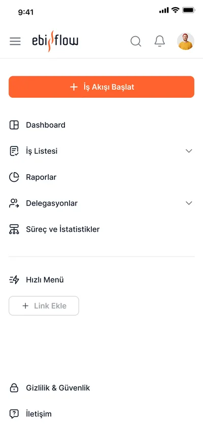
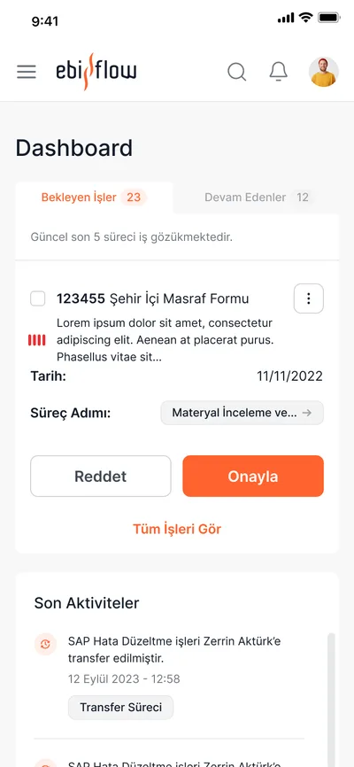
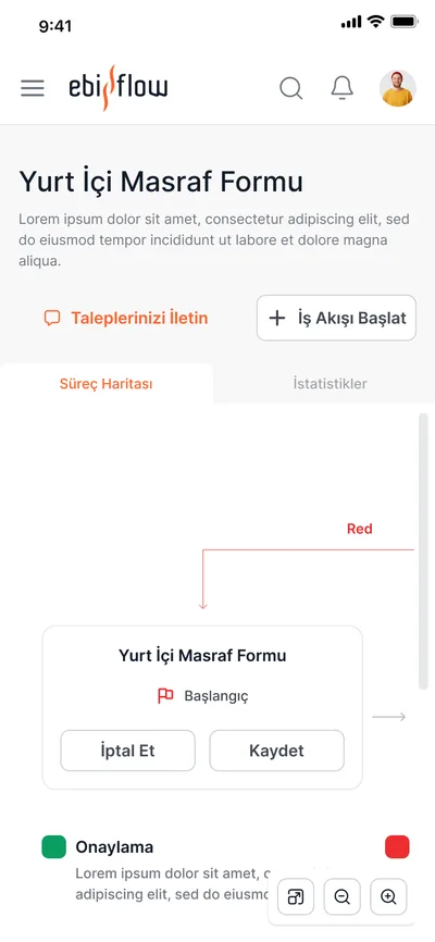
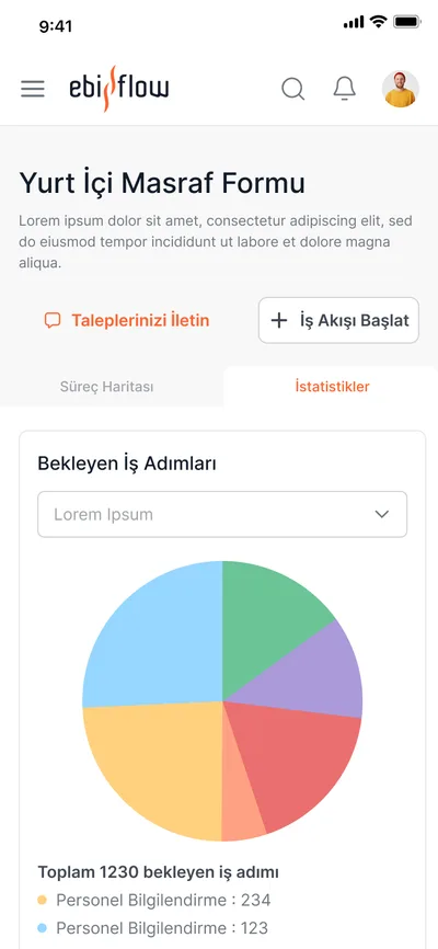
I grounded the breakpoint rules in the research: on mobile the priority isn't filling forms, it's approving pending items and tracking progress.

In an enterprise product, the most expensive thing is a user looking around asking 'who do I ask?'
The decision I'm proudest of was finding the backbone shared by all 17 flows and mounting everything on it — learn one flow and you've learned the rest. If I started over, I'd negotiate the research timeline earlier and add one more usability round after design to validate the findings.
The 120-screen cap looked like a wall; once research said which 120 mattered, it became liberating.
Users didn't want new features — they wanted to see where the existing process stood.
A system that wears any identity only survives if it's built on tokens and immutable behaviours.