Role
Product Designer (self-initiated)
2026
The whole process was solo: research, product decisions, flow, wireframes, UI kit and final screens.
In the research, users call these products “slot machines”: you roll, most rolls miss, and every roll costs money. I grouped the complaints into six themes and built the design on them.
The money comes from marketing teams, not consumers. Their problem isn't model quality, it's being able to defend the output. The product has to sell trust, not speed.
Credit is spent at generation, not on acceptance or download. One usable clip needs several attempts, all of them paid, and no pricing screen says so. Failed renders burn credit too, and the error rarely says why.
The problem isn't the quality ceiling, it's variance: the same effort gives a different result each time. The design's job isn't a better model. It's making cost, waiting and failure predictable.
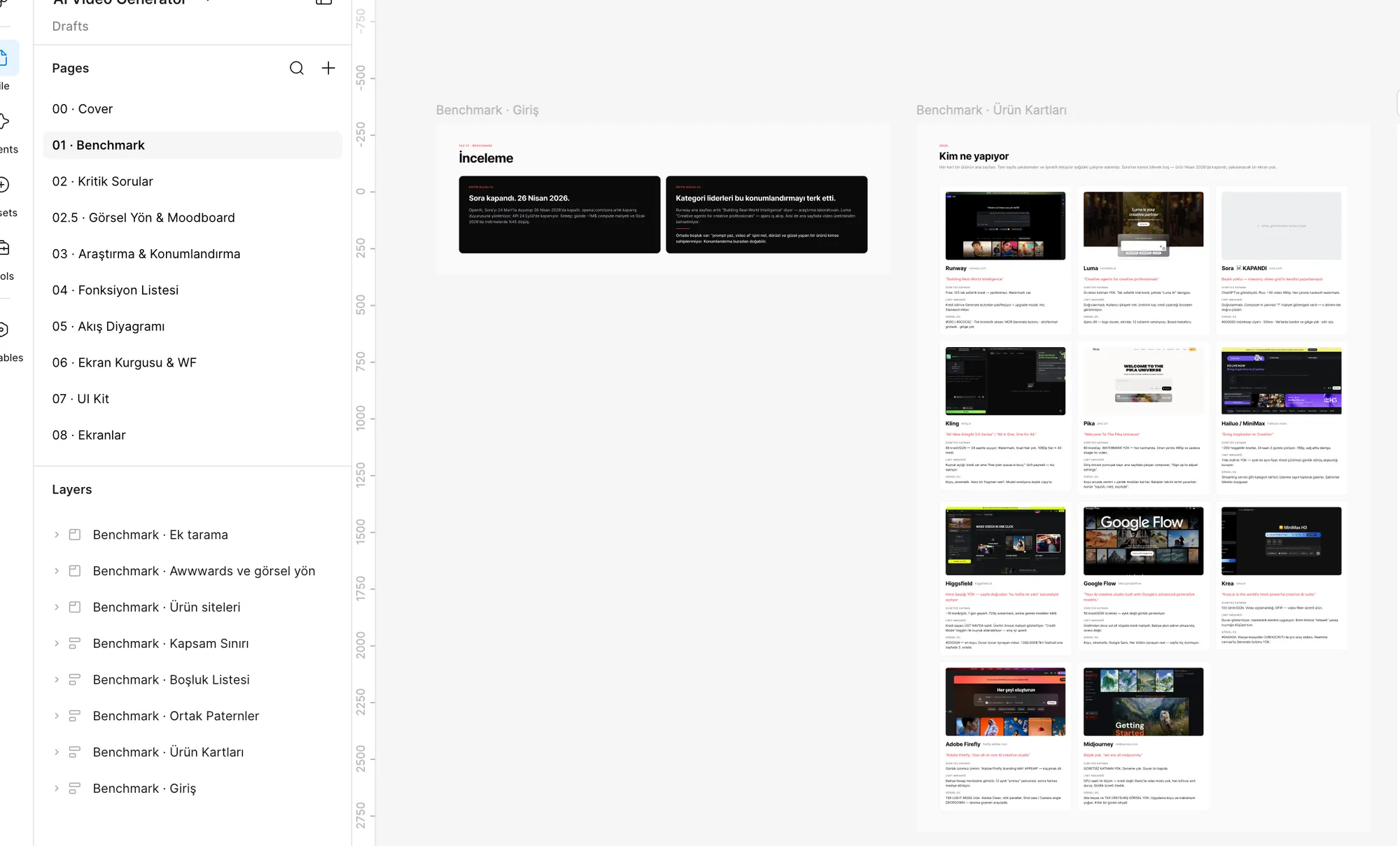
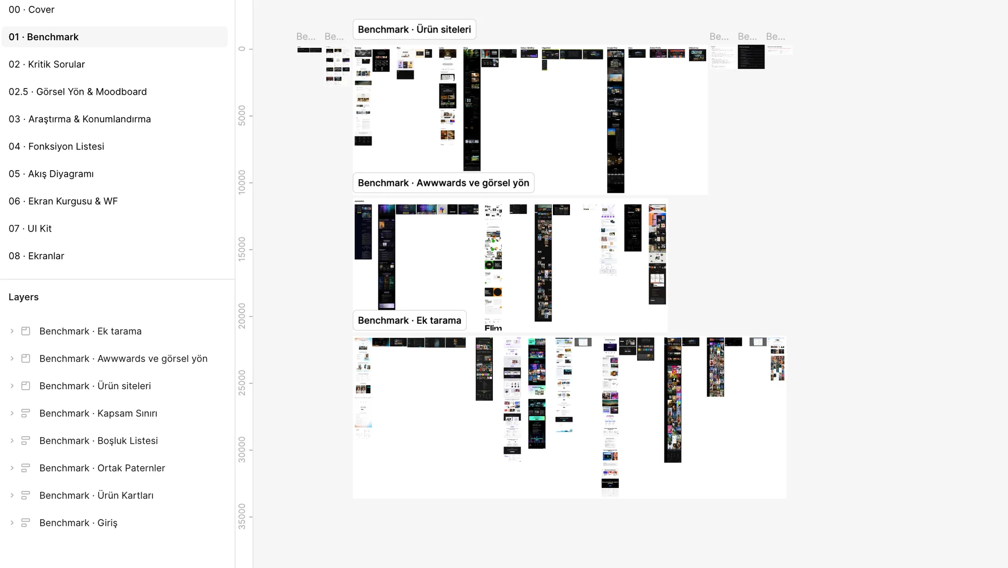
I ran the benchmark and desk research side by side. Every figure traces back to a source with a stated method. Vendor claims are flagged separately, and numbers I couldn't find stayed out.
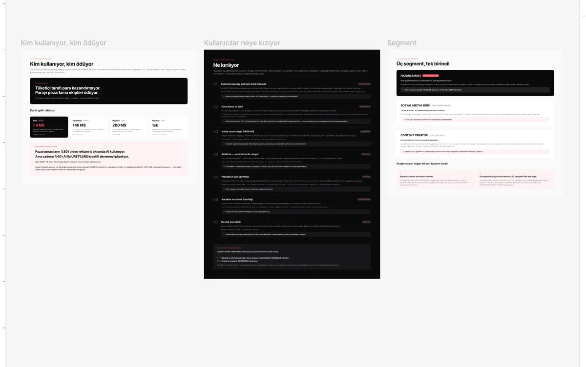
80% of marketers use AI in their video ad workflow, but only 40% plan to test AI-generated creative. The 40-point gap isn't a lack of interest, it's a trust problem.
Source: iSpot, 2026 TV & Video Ad Strategy Report70% of Synthesia's revenue comes from enterprise customers. According to independent transaction data, Runway is the only platform in this group making meaningful money.
Sources: Sacra · YipitDataIn a survey of more than 16,000 creatives, 34% name unreliable output quality as a problem. Consistency beats peak quality.
Source: Adobe / Harris PollAs of September 2026, Runway rates low on Trustpilot but 4.2/5 on G2. Anger at billing and satisfaction with the product can live side by side in the same product.
Sources: Trustpilot · G2I didn't write the goals as nice-sounding principles. I wrote them as two rules every screen could be tested against. The first-draft positioning line sat on top of them: “AI video for teams who have to defend the result.” (first draft)
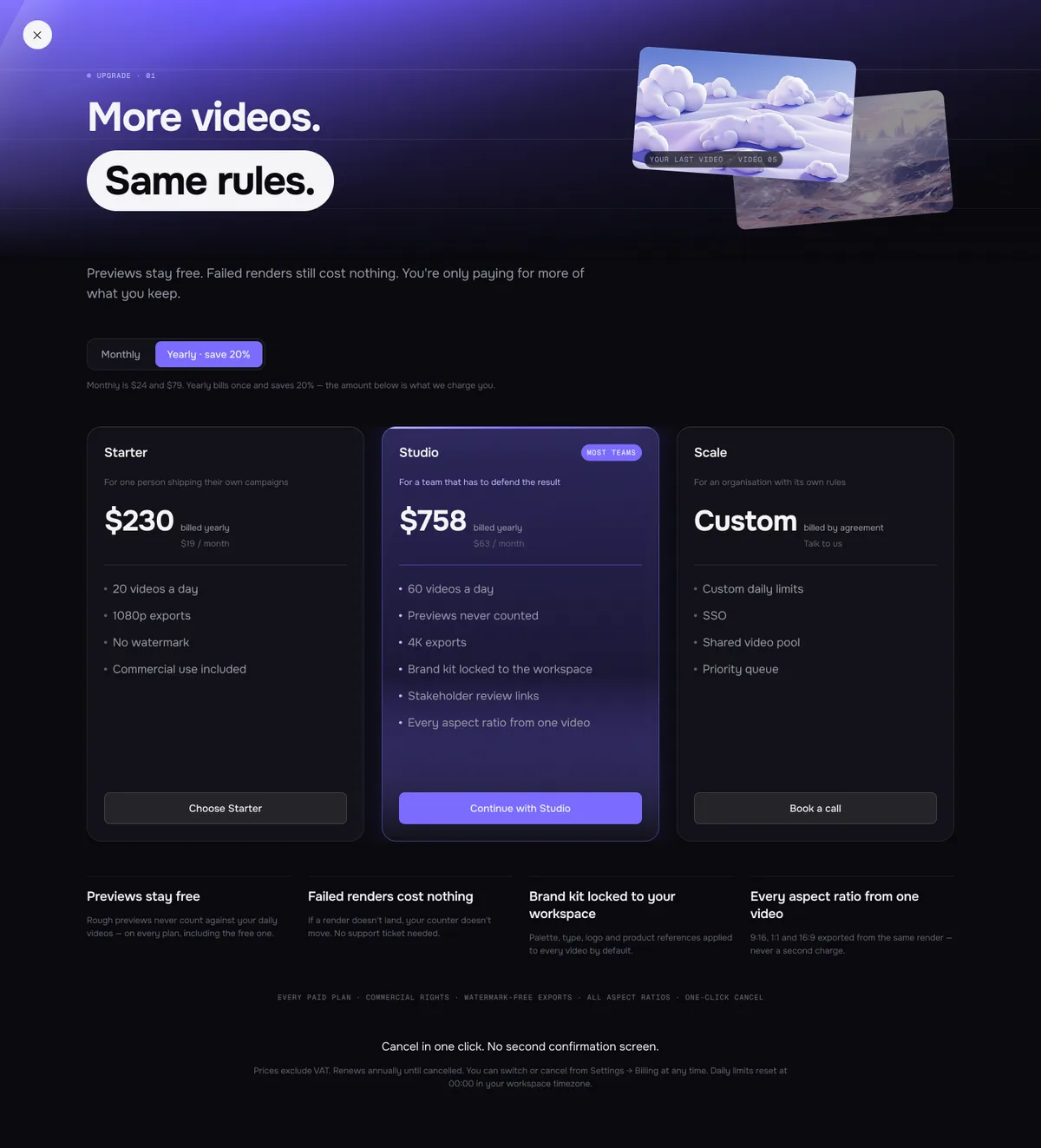
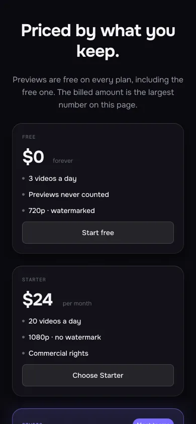
A documented, recurring reason people leave; at competitors it has turned into a “bad results are subjective, no refunds” policy. This promise stays visible on the pricing screen: cheap, defensible, and a difference no one else makes. On the final landing it went into the trust strip: “Failed renders never charged.”
Single-pass generation is short, and quality drops along an extension chain. The atomic unit of AI video is a short clip. An honest product isn't a generation surface; it's a surface for assembly, continuity and revision.
All three segments made sense: the marketer, the social media team and the content creator. But only one of them clearly pays at scale.
The target and the wallet. In-house performance and product marketing teams at mid-sized brands. Their need isn't a model problem, it's a UX problem: consistency is solved by workflow design, not a better model.
→ A new player can't win on the model; it can win on the workflow.
The entry door, not the wallet. Small teams publishing daily across several platforms. They use it most often, and they sit in the same company as the primary buyer.
→ Designed for them, priced for the marketer above them.
Distribution and reputation. Individual creators, the real residents of the free tier. Subscription economics are structurally weak for them.
→ They produce the social proof, tutorials and templates. So the free tier has to be genuinely usable.
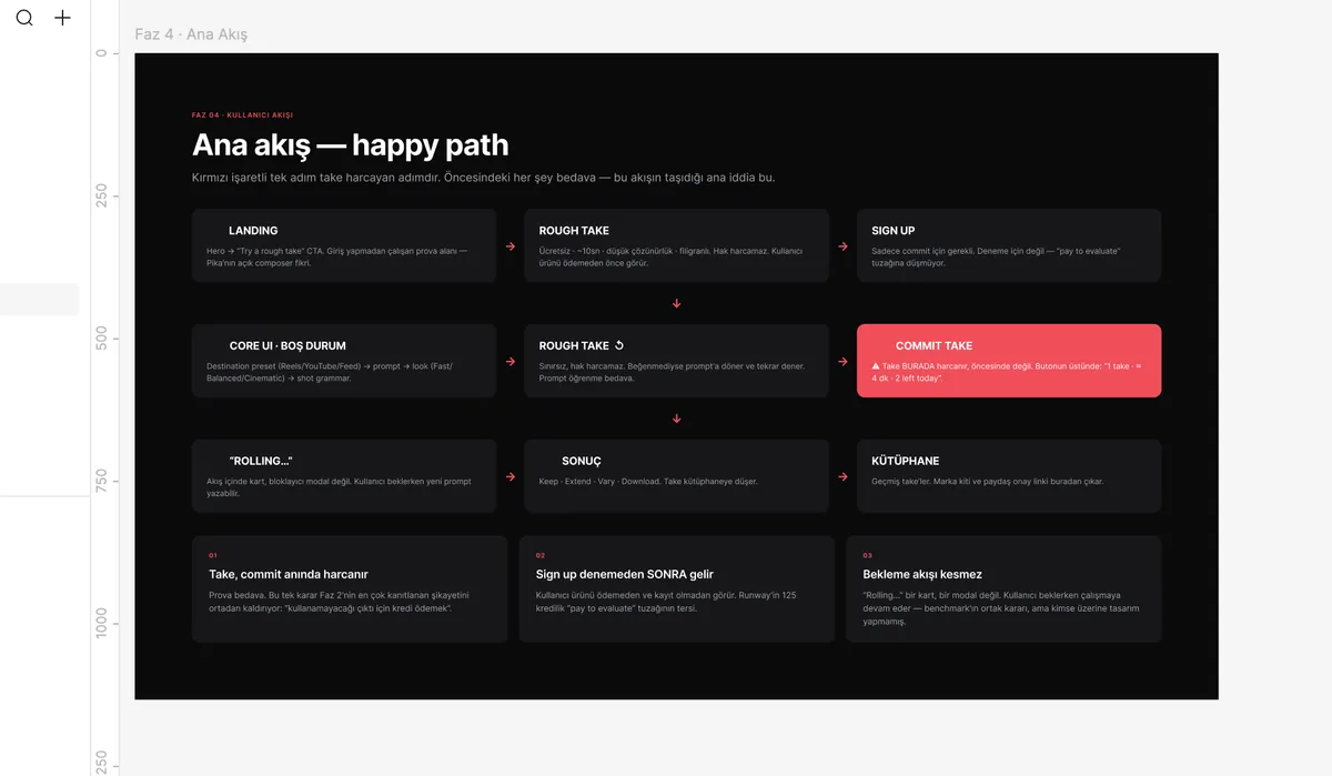
I built the main flow on a single claim: everything up to the final render is free. People see the product before they pay or sign up.
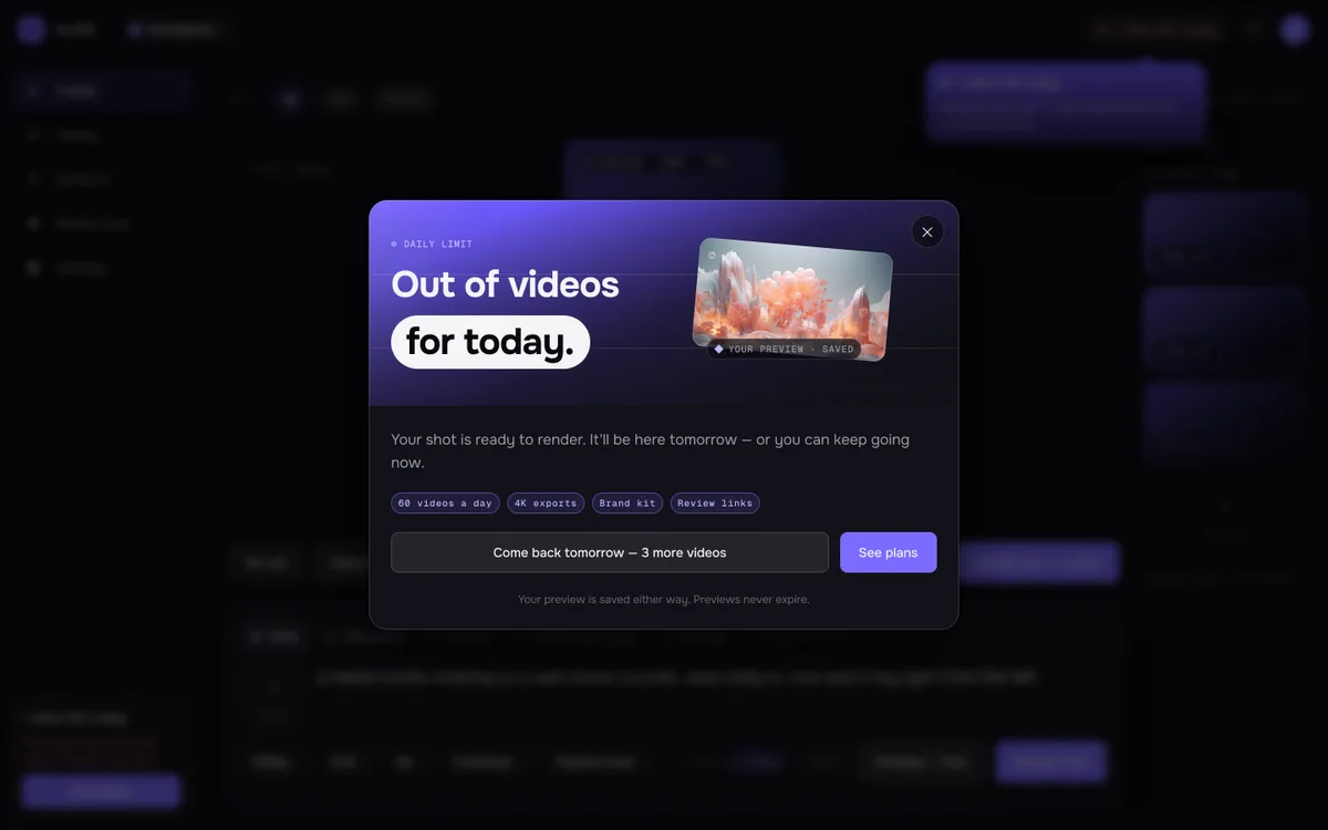
A video is spent at the final render; previews are free.
Sign-up comes after trying; the opposite of the “pay first, try later” trap.
Waiting doesn't break the flow.
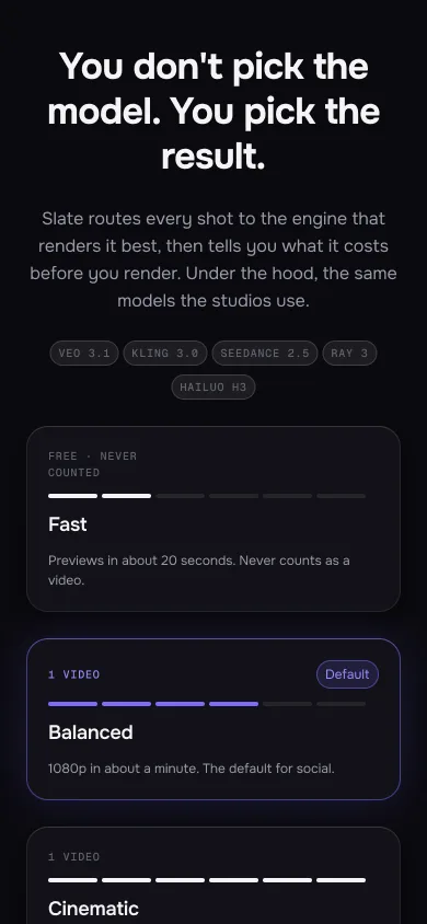
Three decisions: what I let people choose, where I take the money, and what I count. I changed the third one along the way.
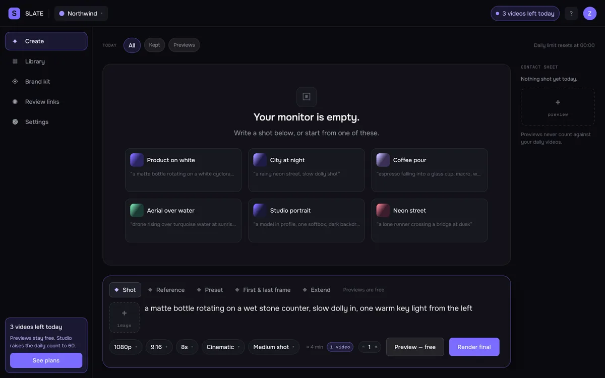
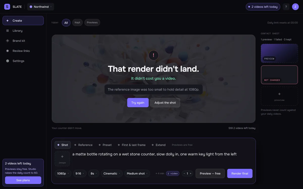
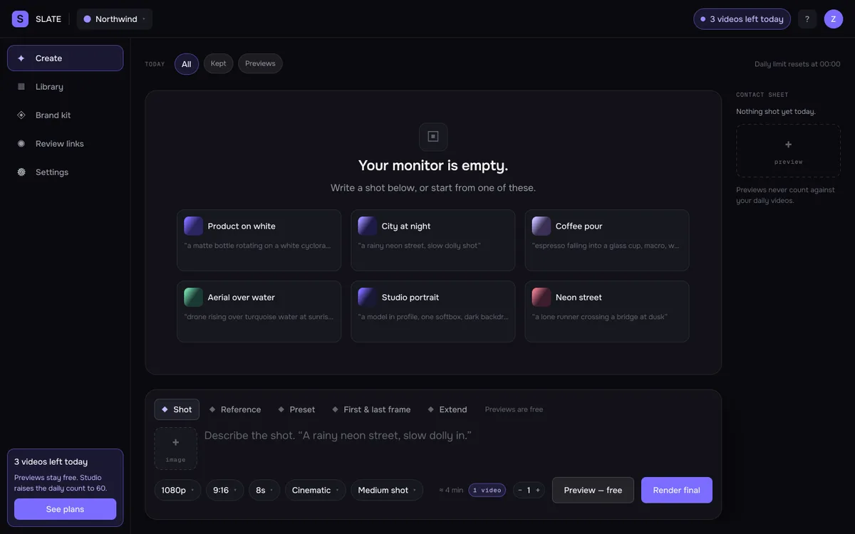
With eight wireframes I solved what each screen does first, and how it looks later. Below, each wireframe sits next to its final counterpart.


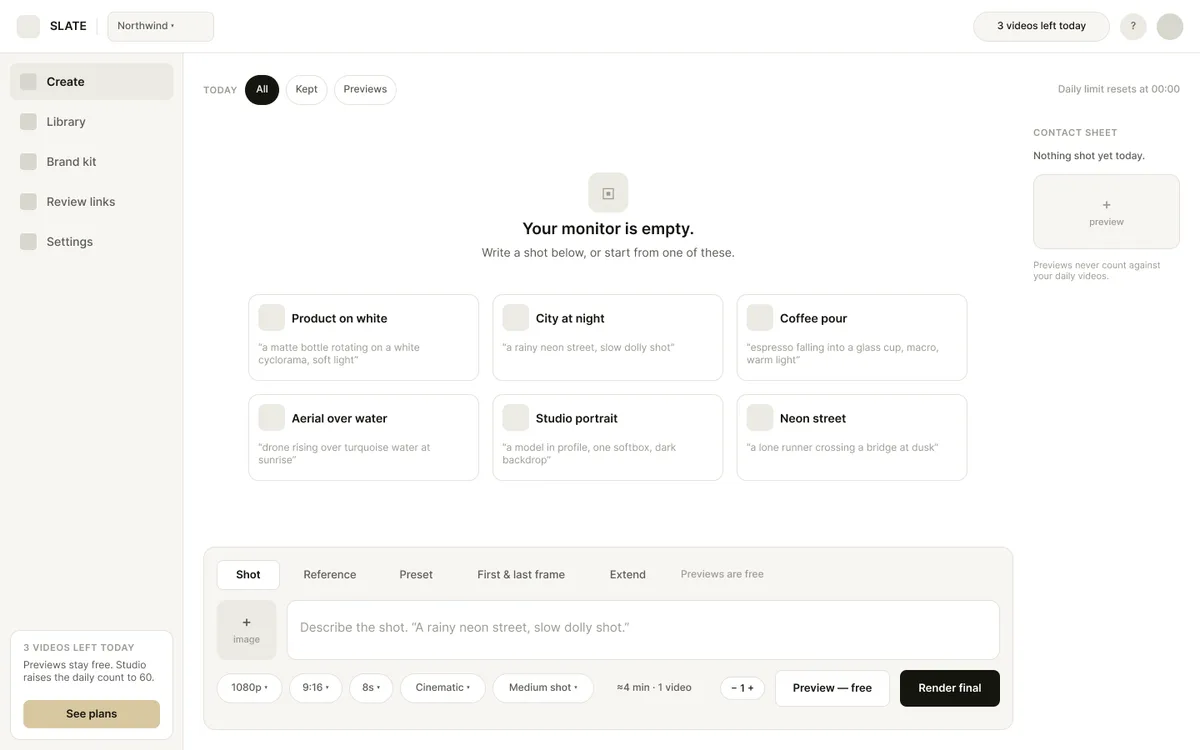
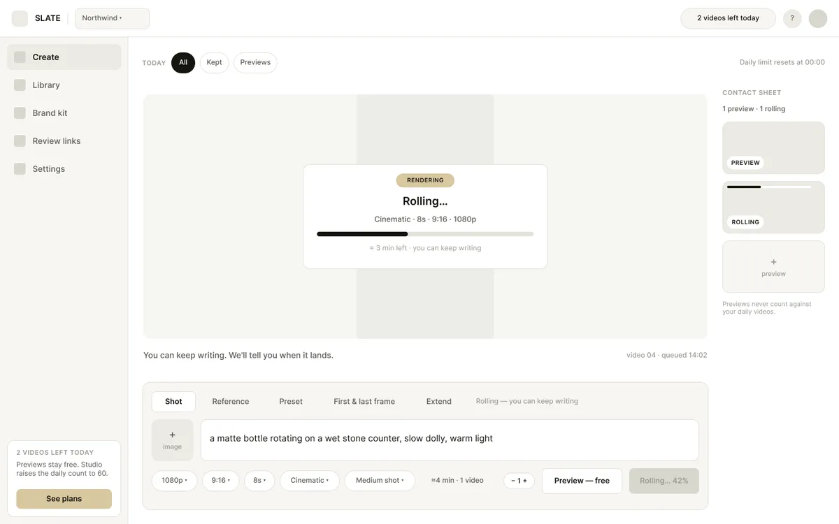
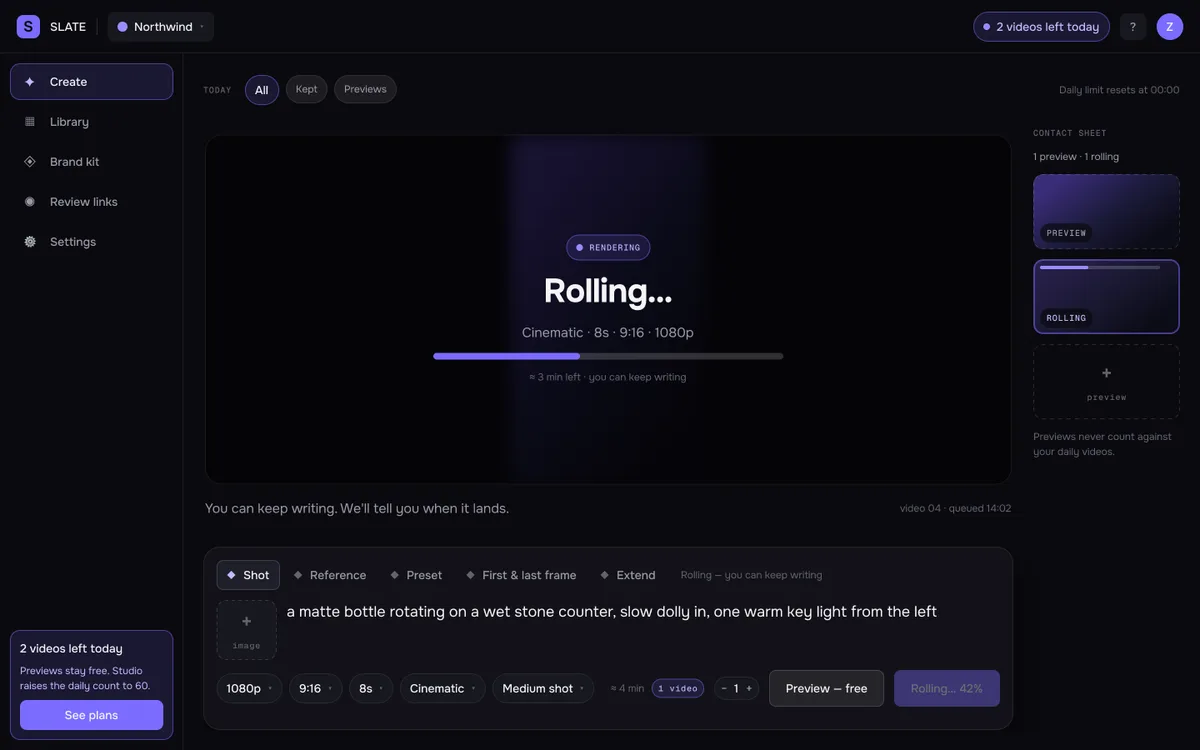
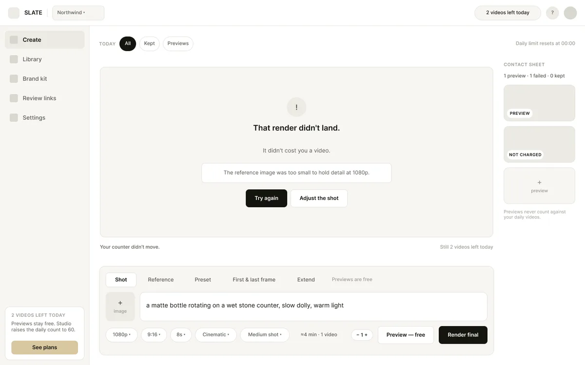
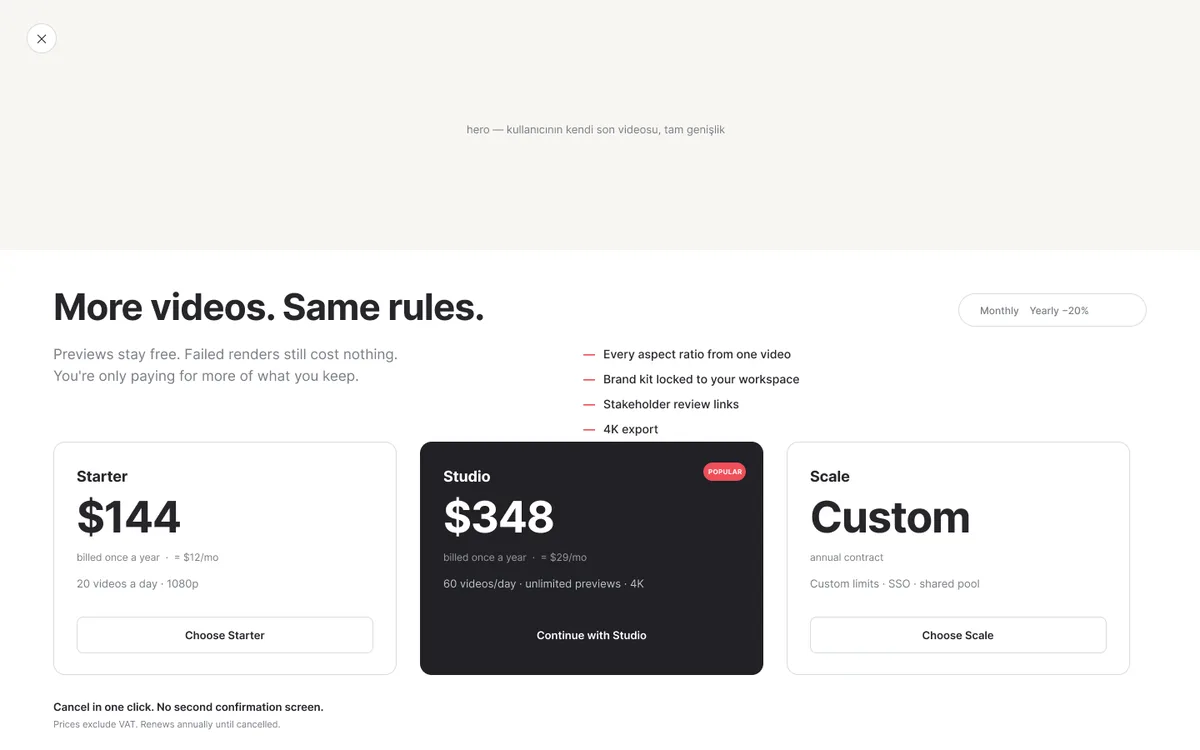
Wireframe stage — pricing was still placeholder.
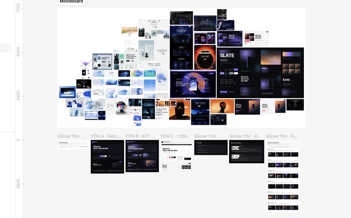
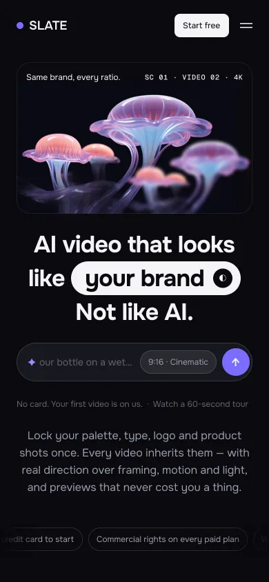
A dark-only theme: base #0A0A0F, accent #7B6CFF. I used the accent for three jobs only: the primary action, the active or selected state, and the “free/included” affirmation. Never for decoration. That was also the strongest shared decision in the benchmark: the only saturated thing on screen should be the generated image.
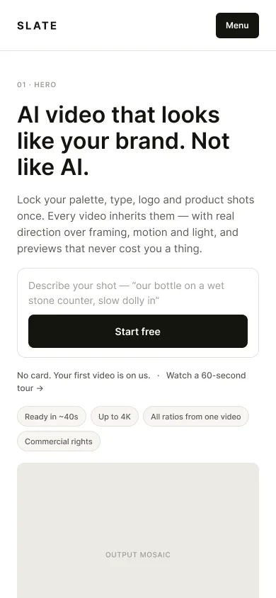
The mobile landing carries the same 11 sections as desktop. Sections drop to a single column, and on mobile the composer gains a collapsible state. Type scales down through its own parallel mobile style set.


Where I used AI, and where I didn't.
I decided up front where AI would come in, rather than reaching for it whenever things got tight.
I used it for scanning. Reading the pricing pages of dozens of products, the complaint forums, page after page of reviews, and sorting all of it into themes would have taken me days on my own. I used it for copy variations. And I used it to push the design system into Figma — tokens, variables, file structure; the work I don't enjoy but that everything falls apart without.
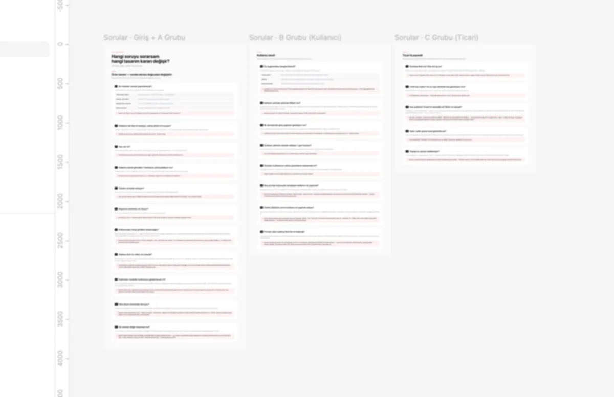
I wrote the question set myself. Twenty-four questions, each tied to the screen it would change. That's the backbone of the whole thing, and I wasn't going to hand it over. The suggested benchmark list felt narrow to me too, so I scanned the category myself, then went to Awwwards and out of the category entirely for visual direction. I'm glad I did — that's where the product's look came from.
The wireframes were the hardest part. The first structure was correct on paper, everything in its place, but it didn't work once I looked at it. I couldn't say why at first, it just felt wrong. In the end I described the structure I had in my head and had the second version built from that. You can't tell whether a screen works by describing it. You have to look at it.
I designed the whole interface myself. On the design decisions — the intent selector, where payment sits in the flow, what's big and what isn't — the help I got was limited. These don't come from a source, they come from a preference.
One thing I saw too late. I changed the unit from take to video while moving to the final screens. The brand was built on “take”, but what people actually count is videos. I should have caught it earlier. Next time I'd put the counter in at the wireframe stage, with the real copy, and look at it there.